Recent global warming spike solved
An Australian high school math teacher can’t understand why everyone is so perplexed about the recent temperature spike. He says that a very simple explanation exists, namely that it was merely the result of an exceptionally strong El Niño superimposed on a steadily rising background due to global warming. First published by Ralph Alexander on his blog Science Under Attack.

For the last two years it’s baffled climate scientists, who have been besides themselves trying to explain the apparent totally unexpected spike in recent global warming. Typical headlines in the media have included (see here, here, here and here):
What’s Causing the Recent Spike in Global Temperatures?
Charting the Exceptional, Unexpected Heat of 2023 and 2024
2023, 2024 climate change records defy scientific explanation
Scientists Stumped By 2024’s Heat Spike
At a meeting of the American Geophysical Union in Washington, DC on December 10 last year, very few hands were raised when NASA climate scientist Gavin Schmidt asked how many attendees agreed that we understand why 2023 and 2024 were so hot. Asked a slightly different question, a majority of the audience concurred that an adequate explanation didn’t yet exist. Schmidt himself has used the phrase “uncharted territory” to describe the spike.
The spike can be viewed graphically in several ways. One way is by examining NOAA satellite temperature data compiled by PhD meteorologist Roy Spencer and Alabama state climatologist John Christy:
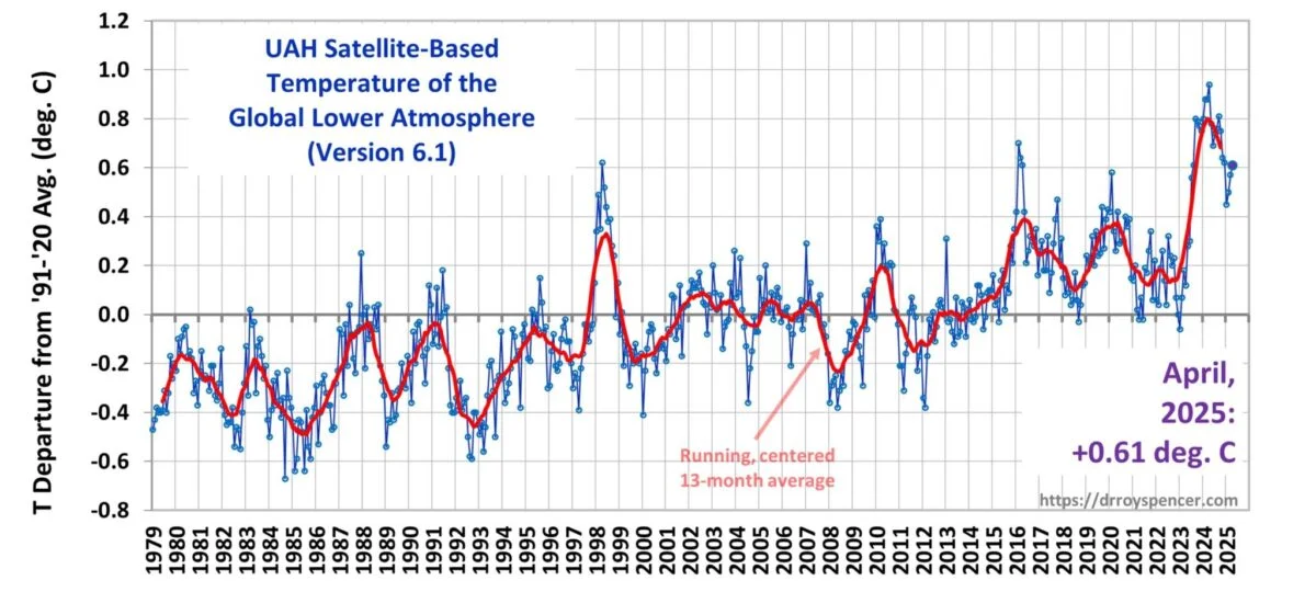
The 2023-24 spike on the far right represents an extra strong El Niño, comparable to the one observed in 1997-98. The graph shows that the event raised the globally averaged temperature of the lower troposphere to a record 0.94 degrees Celsius (1.7 degrees Fahrenheit) above the 1991-2020 mean.
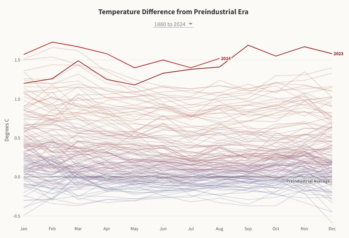
Another, perhaps more dramatic, way of viewing the spike is by plotting monthly temperatures for all years since 1880, compared to the preindustrial average, as depicted in the next figure. The warming surge during 2023 and 2024, which began with elevated global sea surface temperatures before the El Niño kicked in, stands out clearly.
But an Australian high school math (maths to Aussies) teacher who often comments on my blog can’t understand why everyone is so perplexed, saying that a very simple explanation exists – namely that the temperature spike was merely the result of an exceptionally strong El Niño superimposed on a steadily rising background due to global warming. The same effect will occur for any form of periodic variability.
The teacher, who goes by the screen name Braintic, points out that the phenomenon can be visualized mathematically by comparing the graph of the periodic function y = sin x with that of the function y = x + sin x, as shown in the figure below. Here x represents an assumed linear increase in global temperature with time, which may or may not be due to greenhouse gas emissions, and sin x represents periodic natural variability.
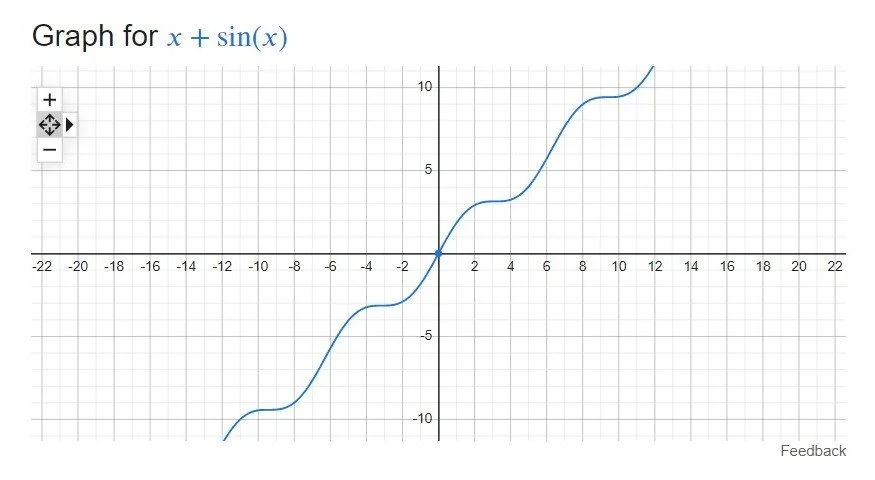
As Braintic emphasizes, the graph of y = x + sin x is a series of step increases superimposed on a rising trend. Exactly the same behavior can be seen in the first, satellite figure above.
In fact, such a staircase effect for global temperatures has actually been commented on before, by eminent New Zealand climate scientist Kevin Trenberth who made the following statement in an article published in July 2023, when the present spike was barely underway:
The combination of decadal variability and the warming trend from rising greenhouse gas emissions makes the temperature record look more like a rising staircase, rather than a steady climb.
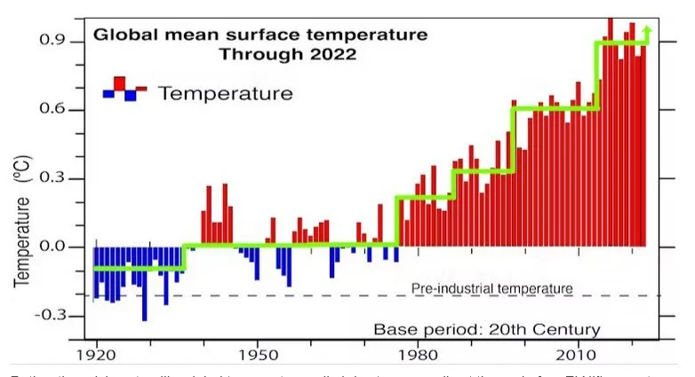
Apparently, Trenberth’s prophetic comment – illustrated in the figure below – has gone unnoticed by his climate science colleagues, who have continued to make a mountain out of the proverbial molehill about the recent temperature surge. Trenberth remarks that the resulting temperature steps usually occur at the end of an El Niño event.
The staircase effect has been noticed by other scientists too, although none as perceptive as Braintic or Trenberth. In a 2024 blog post, I discussed a provocative hypothesis that links an upsurge in underwater seismic activity to recent warming.
The hypothesis was proposed by retired professor Arthur Viterito, whose starting point was the distinct step increases observed in satellite measurements of global warming, displayed in the first figure above. Viterito links these apparent jumps to geothermal heat emitted by volcanoes and hydrothermal vents in the middle of the world’s ocean basins. However, the explanation put forward here seems much more plausible.
Another revealing observation made by Braintic is that the magnitudes of the 1997-98 and 2023-24 El Niños are virtually the same, also contrary to the prevailing wisdom among climate scientists.
The Spencer-Christy satellite data shows that, for the 1997-98 El Niño, the background temperature anomaly (departure from the 1991-2020 mean) was -0.20 degrees Celsius averaged over the previous 10 years, and +0.35 degrees Celsius during the peak year of 1998. That’s a jump of 0.55 degrees Celsius.
For the 2023-24 El Niño, the background temperature anomaly was +0.23 degrees Celsius averaged over the previous 10 years, and +0.77 degrees Celsius during the peak year of 2024. That’s an almost identical jump of 0.54 degrees Celsius.
So two down-to-earth types from down under have solved a puzzle that has mystified hundreds in the climate science community!


more news

New study finds low CO2-sensitivity again
A new paper by Frank Stefani compares solar variability and CO₂ emissions as drivers of global sea surface temperatures. Using the solar aa geomagnetic index alongside CO₂ data, the study estimates a transient climate response (TCR) of about 1.1–1.4 K, near the lower end of the IPCC range. The results align closely with other observation-based estimates and highlight the continuing scientific debate about the relative roles of solar activity and greenhouse gases in recent climate change.

Clintel Ambassador Ian Plimer on popular Triggernometry podcast: “Climate science is the biggest cult in scientific history”
Clintel-ambassador for Australia, prof. Ian Plimer, didn’t hold back in his recent interview on the popular Triggernometry podcast: “There’s a very large body of people out there who are actually using science to promote scams. It’s absolutely crippling Western countries. You can’t run an industrial society on sea breezes and sunbeams.”

Groundbreaking New Paper Challenges Foundation of Climate Change Assessments, Revealing Fatal Flaws in Ocean Heat Content Measurements
An international team of scientists has published groundbreaking research revealing that the primary measurement used to support claims of planetary “warming” is fundamentally flawed and scientifically invalid.

