This is the last in my current series of posts on ocean temperatures. In our previous posts we compared land-based measurements to sea-surface temperatures (SSTs) and discussed problems and contradictions in the land-based measurements (see here). This first post was overly long and complicated, but I needed to lay a foundation before getting to the interesting stuff. Next, we covered the basic thermal structure of the ocean and how it circulates its enormous heat content around the world (see here). This was followed by a description of the ocean surface or “skin” layer here. The ocean skin is where evaporation takes place and it is where many solar radiation wavelengths, especially the longer infrared wavelengths emitted by CO2, are absorbed, then evaporated away, or reflected.
The next post covered the mixed layer, which is a layer of uniform temperature just under the skin layer. The mixed layer sits above the thermocline where water temperature begins to drop rapidly. The next post discussed the differences between various estimates of SST, the data used and the problems with the measurements and the corrections. The emphasis was on the two main datasets, HadSST and NOAA’s ERSST. The most recent post discusses SST anomalies, the logic was, if all the measurements are from just below the ocean surface, why are anomalies needed? Why can’t we simply use the measurements, corrected to a useful depth, like 20 cm?
The theme of all the posts is to keep the analysis as close to the measurements as possible. Too many corrections and data manipulations confuse the interpretation, remove us from the measurements, and homogenize the measurements to such an extent that we get a false sense of confidence in the result. This illusion of accuracy, due to over-processing data, is discussed by William Brigg’s here. His post is on smoothing data, but the arguments apply to homogenizing temperatures, creating anomalies from the mean, of bias correcting measurements utilizing statistical techniques. All these processes make “the data look better” and give us a false sense of confidence. We come away not knowing how much of the resulting graphs and maps are due to the corrections and data manipulation and how much are due to the underlying measurements. We progressed step-by-step though all the processing we could and examined what the temperatures looked like at every step. We are trying to pull back the wizard’s curtain, as much as possible, but probably not as well as Toto.
Area-Weighting
The data used in all these posts, except the earliest posts on the land measurements in CONUS (the conterminous United States, or the “lower 48”), were all from latitude and longitude grids. Gridding the measurements is needed globally because the measurements are mostly concentrated in the Northern Hemisphere, and very sparse elsewhere and in both polar regions. As we’ve previously shown, Northern Hemisphere temperatures are anomalous, the rest of world is much less variable in its surface temperature. See here for a discussion of this and some graphs. See this post by Renee Hannon and this one by the same author, for more detail on hemispheric variations in temperature trends.
While gridding is probably not necessary, and may be misleading, in areas like the United States, that are well covered with good weather stations, to produce a global average SST, we need to grid the available data. This is not to say that gridding replaces good measurements or improves the measurements, just that with the data we have it is necessary.
Each grid cell represents a different area of the ocean. The difference is a function only of latitude. Each degree of latitude is 111 km. A degree of longitude at the equator is also 111 km. but decreases to zero at the poles. So, to compute the area of each grid cell we only need to know the latitude of the cell and size of the grid cells in latitude and longitude. The solution is provided and derived by Dr. Math (National Council of Teachers of Mathematics), here. I won’t interrupt the narrative with an equation, but the R code linked at the bottom of the post shows the equation and how it was used.
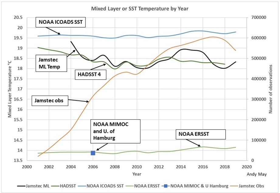
It might seem odd to do such an obvious correction to the data last, but I honestly wanted to see if it made much difference. It turns out to make a substantial difference in the computed average temperature, but little difference in the trends. Below in Figure 1 is the original figure from the mixed-layer post, comparing various estimates of SST and the mixed layer global average temperature. Normally, especially at night, the mixed layer and the SST are very close to one another, so plotting them all together is valid.

Figure 1. The comparison of mixed layer and SST global temperature estimates from the mixed layer post. For an explanation of the plot see the post here.
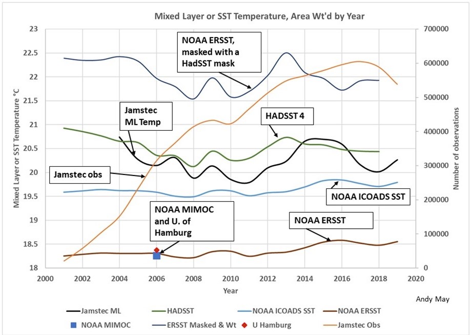
The curves in Figure 1 are all corrected to a depth between 20 cm. to one meter. They are grid averages, that is averages of gridded values, but they are not corrected for the area represented by each grid value. Figure 2 is the same graph but constructed with area-weighted grid cell values. We’ve also added one new curve, the NOAA ERSST curve, after nulling the ERSST values corresponding to null values in the HadSST dataset. That way we are comparing ERSST and HadSST over the same global ocean areas. The normal ERSST dataset (the lower green line in Figure 1 and the lower brown line in Figure 2) uses interpolation and extrapolation to populate grid cells that have insufficient data, these cells are null in HadSST.
At first glance the two graphs look very similar but notice the vertical scale has changed. Everything is shift up two to four degrees since the polar regions have cells with smaller areas. The NOAA ICOADS SST line is in the same place since it was already area corrected. It is also the line that is closest to the measurements, the processes used to make this line are much simpler and less complicated than those used by HadSST and ERSST. The difference between HadSST and ERSST is still there, but smaller. These two temperature records use similar data, but, as described above, their gridding is different and they cover different areas. Once the ERSST grid is “masked” to conform with HadSST, it pops up to 22 degrees, from 18.2.

Figure 2. This is the same plot as in Figure 1, except all the grid values in the records are weighted by the grid cell areas they represent. Notice the vertical scale has changed.
The NOAA MIMOC and University of Hamburg multiyear grid averages plot on top of the NOAA ERSST record in both plots, but are warmer by about 4.5°C after applying the area weighting algorithm. NOAA MIMOC and the University of Hamburg create their grids using more than 12 years of data, so they populate much more of their grid than the single year datasets. They also weight Argo and buoy data heavily, just like NOAA ERSST.
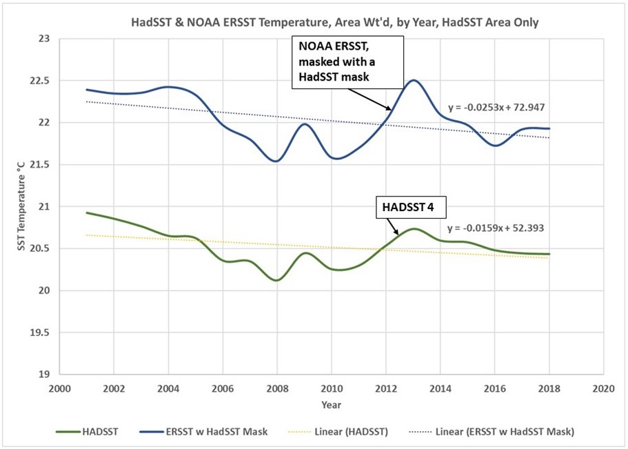
As we saw with the unweighted data in the last post, The HadSST measured temperatures trend downward. When the ERSST grid is masked with the HadSST nulls, it also trends downward. This is seen in Figure 3.

Figure 3. Declining SSTs over the HadSST covered area are apparent in both the HadSST and ERSST datasets.
The HadSST dataset only has grid values where sufficient measurements exist to compute one, they do not extrapolate data into adjoining grid cells like ERSST. Thus, the HadSST data represents the portion of the ocean with the best data, and this area is clearly declining in temperature, when only the measurements are used. The ERSST suggests a decline of 2.5 degrees/century. The HadSST decline is 1.6 degrees/century.
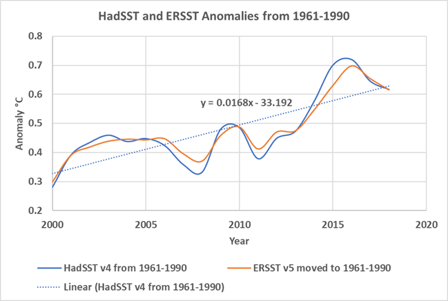
The ERSST line, with no mask applied (Figure 2), has an increasing trend of 1.6 degrees/century. Thus, the interpolated and extrapolated areas show warming that does not show up in the cells with the best data. As we saw in the last post and show again in this post as Figure 4, the HadSST and ERSST anomalies show none of the complexity it took six posts to cover. They show a joint trend of warming, of about 1.7 degrees/century.

Figure 4. The HadSST and ERSST anomalies.
Conclusions
The best way to analyze data is to use the absolute minimum statistical manipulation required present it in usable form. Every correction, every computation, all smoothing operations, every gridding step must be fully justified. It is an unfortunate fact of scientific and engineering life today that our colleagues are forever coming up with “this must be corrected for,” that must be corrected for,” and so on. Little thought is given to how the corrections affect our perception of the resulting graphs and maps. With enough corrections one can turn a pile of manure into a castle but is it really a castle?
I had a boss once who was very smart, he eventually became the CEO and chairman of the board of the company we worked for. I was much younger then and I was one of the scientists in the peanut gallery who kept asking “What about this?” “What about that, have you corrected for these things?” My boss would say, “Let’s not out-science ourselves. What does the data say, as it is?” After he became CEO, he sold the company for five times the average strike price of my accumulated stock options. I was still a scientist, albeit a wealthy one. He was right, so is Dr. William Briggs. Study the raw data, keep it close to you, don’t “out-science” yourself.
I reprocessed a lot of data to make this post, I think I did it correctly, but I do make mistakes. For those that want to check my work, you can find my new area-weighting R code here.
None of this is in my new book Politics and Climate Change: A History but buy it anyway.

Andy May, now retired, was a petrophysicist for 42 years. He has worked on oil, gas and CO2 fields in the USA, Argentina, Brazil, Indonesia, Thailand, China, UK North Sea, Canada, Mexico, Venezuela and Russia. He specializes in fractured reservoirs, wireline and core image interpretation and capillary pressure analysis, besides conventional log analysis. He is proficient in Terrastation, Geolog and Powerlog software. His full resume can be found on linkedin or here: AndyMay
