By Andy May
Tom Nelson interviewed Dr. Javier Vinós on January 31, 2023, the interview can be seen here. Or click on the image below.
Part of the interview was a prepared presentation. The text and some of the illustrations from Javier’s presentation are given below. The recorded interview has more illustrations and information than this post. It is quite good and recommended. Stay on to hear the discussion between Tom and Javier at the end, it is worth it. And look at the comments, they are very favorable.
Javier’s presentation:
This is the story of a search for a little-known phenomenon called natural climate change. A search that has taken me years.
First, I looked to the IPCC for an answer. They are supposed to have all the answers about climate change.
The IPCC has concluded that recent climate change is caused mainly by greenhouse gas emissions of human origin.
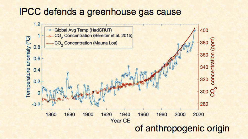
Figure 1. The correlation between CO2 concentration and the global surface temperature anomaly
Their main evidence is that CO2 levels and global temperature have been increasing together over time. The correlation is generally good, although not so good between 1915 and 1945, when the early 20th-century warming took place, nor during the mid-20th-century cooling that followed.
An increase in CO2 levels enhances the greenhouse effect. On a planet without greenhouse gases, the shortwave solar radiation is returned as longwave thermal radiation from the surface. When greenhouse gases are present in the atmosphere, they absorb and emit longwave radiation. This process causes the average height of emission to space to move higher. If the planet has an atmosphere with a positive lapse rate where the temperature decreases as the height increases, as the troposphere does, the surface must warm as the average emission altitude moves upward to return all the energy received from the Sun to space. Doubling the amount of CO2 results in a higher average emission altitude and increased surface warming.
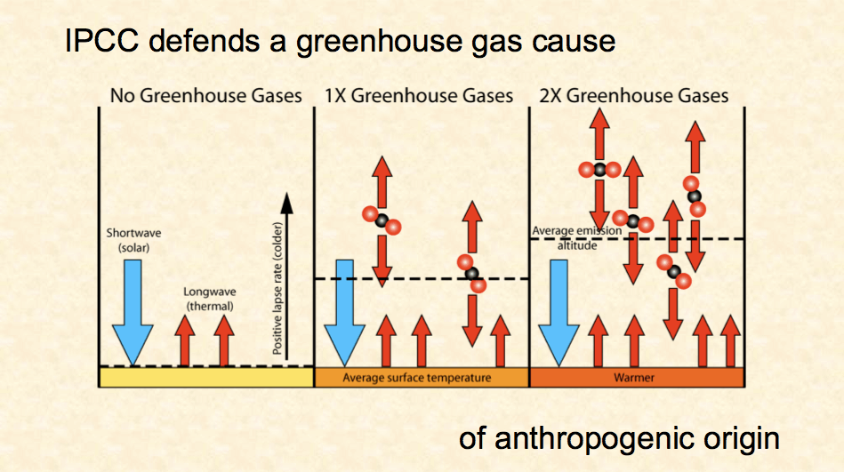
Figure 2. Doubling the greenhouse gas concentration raises the average emission altitude
The greenhouse effect depends on a positive lapse rate and a change in the average height of emission. That’s why it doesn’t work over Antarctica where the surface is generally colder than the atmosphere. The greenhouse effect goes in reverse there and cools instead of warming.
The increase in CO2 only produces a relatively small amount of direct warming, according to the greenhouse theory.
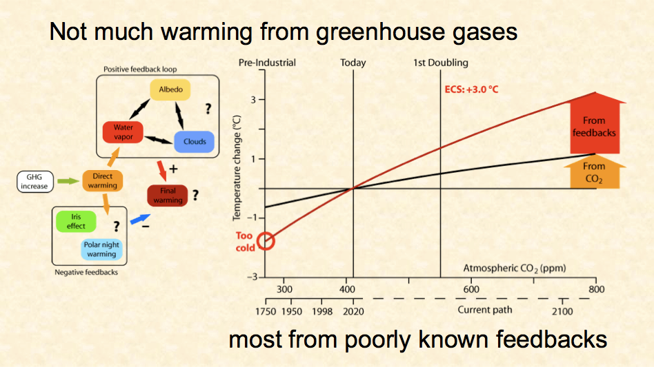
Figure 3. Very little warming is directly due to additional human generated CO2, most is from supposed positive feedbacks. Projecting the IPCC CO2 hypothesis back in time results in much more cooling than observed
Most of the warming is supposedly produced by poorly known feedbacks, whose contribution to the warming cannot be measured because it cannot be distinguished from the signal.
Even less known is the contribution from negative feedbacks. They must exist because stable systems, such as Earth’s climate, are dominated by negative feedbacks. The Iris effect was proposed by Professor Richard Lindzen, and we will see later that I propose Arctic warming as a negative feedback.
Let’s assume that all the observed warming is produced by the CO2 increase. The IPCC wrongly assumes this in climate sensitivity studies, so we will assume it also. Most of the warming should come from feedbacks.
In Figure 4, we see how this is supposed to work for the IPCC with a mean estimated climate sensitivity of 3° Celsius per doubling of CO2. This result cannot be correct. Besides denying a natural climate change effect, it would make the pre-industrial climate far colder than it was.
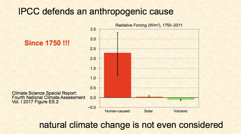
Figure 4. The IPCC assumed global warming forcing since 1750AD
Climate scientists writing these reports defend that all climate change since 1750 has a human origin. Such an absurd claim defies common sense, but this is the outcome their models produce straight from the theory. There is only one possible conclusion. Their theory is wrong or incomplete and their models don’t work.
So, the IPCC answer is that natural climate change is so feeble that it plays no role. They assume that all recent climate change has a human origin, and most of it is due to changes in greenhouse gas levels.
It is time to look at the past and see what natural climate change was, and is, capable of doing.
Figure 5 shows in black global temperature changes over the past 50 million years from a famous article in Science, and in red CO2 levels from a collection of proxies in an article in Nature Geoscience by Beerling & Royer.
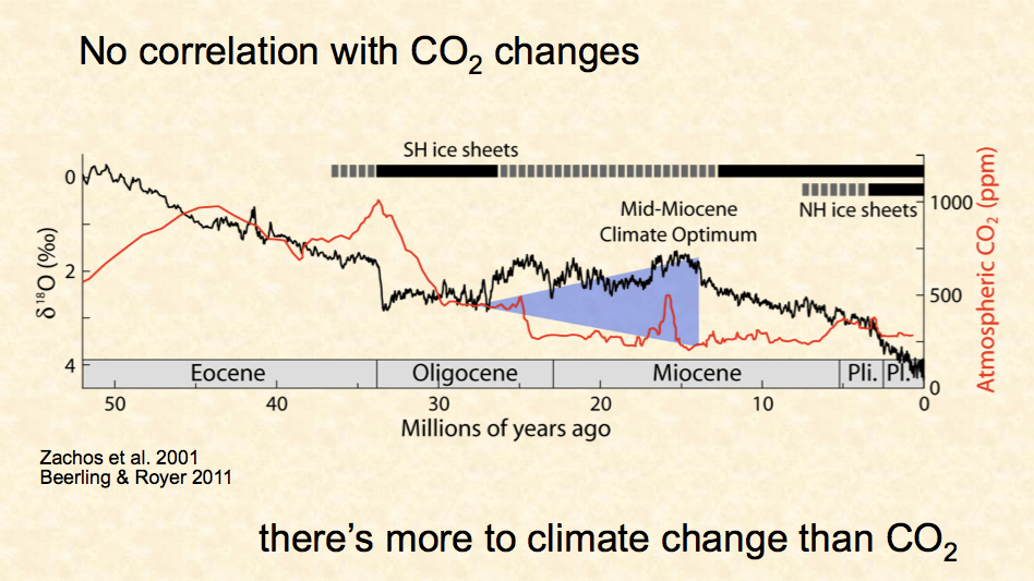
Figure 5. Estimated global temperature, in black, and estimated average CO2 concentration, in red, for the past 52 million years
Despite claims to the contrary by these authors, the data shows that most of the time temperature and CO2 were moving in opposite directions for millions of years. There’s a lot more disagreement than agreement in this graph. The blue triangle highlights a major discrepancy that is over 10 million years long.
At the end of the Eocene, Antarctica froze up in less than a million years and global temperature took a dive at a time when CO2 levels were the highest in the past 52 million years.
Then, from the Mid-Oligocene to the Mid-Miocene-Climate-Optimum the planet warmed quite a lot. Nobody has been able to explain it because CO2 sank to levels significantly lower than what we have today, at the broad end of the blue triangle in the figure. This is discussed in my book, where I propose it was due to tectonic changes affecting atmospheric heat transport.
Close examination of the past 11 thousand years shows the disagreement between temperature and CO2 continues, as shown in Figure 6.
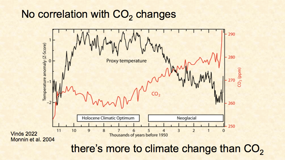
Figure 6. No correlation between CO2 and temperature for the past 11,000 years
The black curve is a temperature reconstruction from 72 proxies published in a famous 2013 Science paper, analyzed differently by me. The data is the same as originally published, but I have expressed it in standard deviations from the average for each proxy. I do not think we can possibly know the temperature of the planet then, if we cannot know the temperature of the planet in the 19th century. Do not jump to conclusions about the end of the curve, because it does not reach the present.
The red curve is the CO2 concentration from Antarctic cores. The range in CO2 levels is tiny, about 20 ppm, which is the change we get today in less than a decade. Even then, CO2 is always doing the opposite to temperature, going down when the temperature stays high, and up when the temperature goes down.
DESPITE these small CO2 changes…
Proxies from different parts of the world sometimes reflect important changes in temperature, wind, and precipitation. The coincidence in time of the changes for different kinds of proxies from different regions of the world reveals over 20 abrupt climate events over the past 11,000 years or about two per millennium. These are times when climate parameters change much faster than the long-term baseline change.
They appear to have different causes, and changes in greenhouse gases can only be a cause for the last one. I won’t go over this list, that is in my book.
But four of the biggest ones took place when solar activity was very low and are separated by multiples of 2500 years. The last three are separated by close to that amount of time, and the first two by close to 5000 years, as shown in Figure 7.

Figure 7. Four major Holocene abrupt climate events
If we go back to the temperature reconstruction, we observe these four events were among the biggest in terms of the temperature effect. The last one is known as the Little Ice Age, which is contemporaneous with the IPCC’s “pre-industrial” period.
In Figure 7 we have added the radiocarbon curve (purple and blue). It has been built since the 1960s by thousands of scientists and is rock-solid science. It is the basis for carbon dating. Scientists measure the ratio of 14C (carbon-14) to 12C (carbon-12) in their sample and establish a radiocarbon date. I didn’t put that in the vertical axis to simplify the graph. Then they use this curve to translate this radiocarbon date into a calendar date.
At times solar activity becomes very low for a long time, and more cosmic rays arrive at the Earth producing more 14C, and the radiocarbon clock runs faster making the samples look younger than they are. This produces the odd bumps in the curve. They correspond to grand solar minima.
The four climate events coincide with four of the biggest grand solar minima of the past. They are of the Spörer-type, which last longer and reduce solar activity the most.
There’s a recent study on the past human population in the British Isles. Human population takes off after the arrival of farmers to the British Isles and it shows a very good correspondence with the temperature reconstruction. Several of the changes coincide in time.
When we look at the last three big climate events, we see substantial population decreases coinciding with all of them. Look how the red population curve drops.
This agreement between independent sources is called consilience and says we are looking at a real phenomenon. When solar activity goes down for a long time, the climate takes a dive, and humans suffer. No other explanation is consistent with this data.
Paleoclimatologists have long recognized it. They write all the time in their articles (see a list of the most important here) about the solar modulation of climate on centennial timescales. They link low solar activity to cooling events, and they even talk about cyclic changes induced by small variations in solar radiation.
They are good scientists in their field, but nobody listens to them. This is wrong and we cannot explain why they are ignored. Why has the solar/climate connection not been properly investigated?
I studied over a hundred papers to see what the different proxies were saying happened in different parts of the world during those four abrupt climate events. I am surprised this has not been done before. Why did a molecular biologist have to do it?
The result is consistent with a complete reorganization of the atmosphere, which takes several decades to a century, and induces severe cooling. The Hadley cell contracts, the polar cell expands, the temperature gradient between the equator and the poles becomes steeper, and more heat is transported poleward, cooling the northern mid-latitudes. See Figure 8.
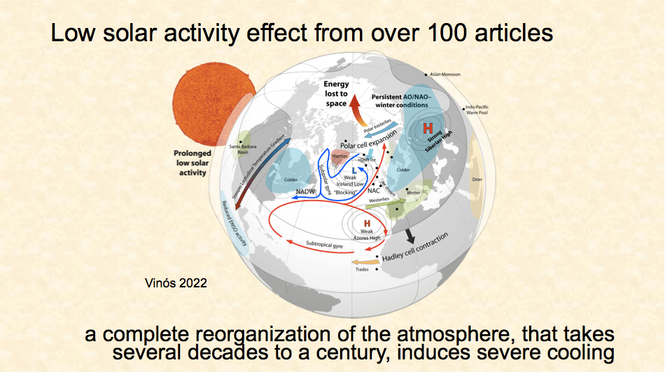
Figure 8. The reorganization of the atmosphere that takes place in abrupt climate events caused by clusters of grand solar minima
The Arctic initially warms from increased heat transport, but as more energy is being lost at the poles in winter, the entire planet starts cooling and the Arctic with it. The effect is strongest in the northern mid-latitudes.
The longer the situation lasts, the colder the planet gets, despite solar activity remaining at the same low level, not much lower than during a regular solar minimum like in 2009. It is like opening a door in winter for a minute or six hours. The house gets much colder in the second case.
The recovery from this atmospheric reorganization is also slow, producing a long period of warming once solar activity goes back to normal.
Past climate analysis tells us that climate change and CO2 changes do not correlate most of the time. Most abrupt climate events we can identify in the past took place in the absence of significant greenhouse gas changes, and several of the events correlate with solar activity changes.
So, let’s see what science can tell us about natural climate changes taking place now. The natural climate change the IPCC says doesn’t matter.
The AMO (Atlantic Multidecadal Oscillation) is defined as an oscillatory change in sea surface temperature in the North Atlantic.
Figure 9 is an image that shows that during a warm AMO, the heat accumulation in the mid-latitudes suggests a heat transport issue.
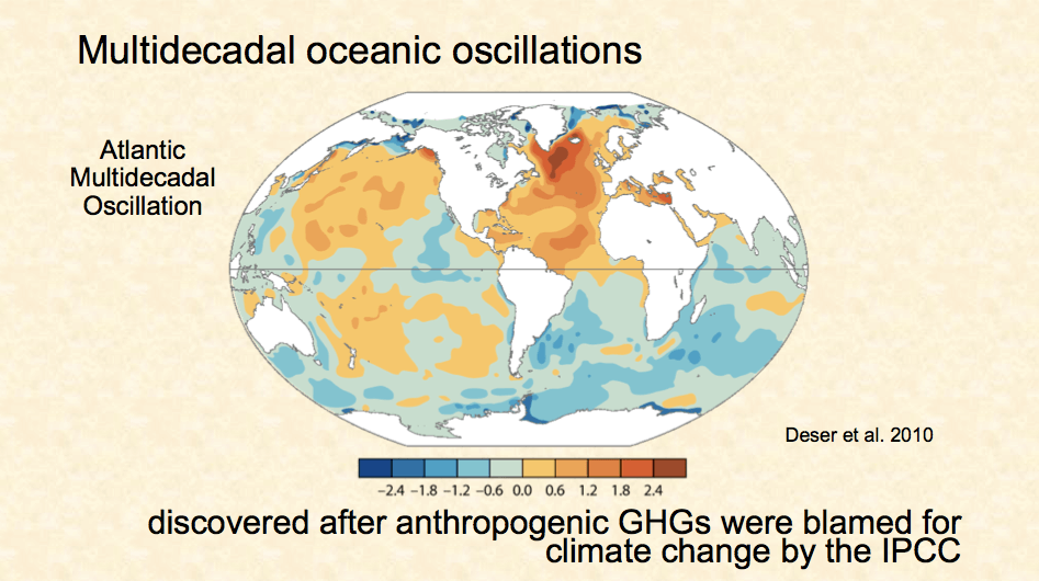
Figure 9. Sea surface temperatures during a warm AMO
The energy input to the climate system is nearly constant from year to year, but energy transport is not, and heat accumulates in certain regions at certain times, as we see in Figure 9.
So, the figure shows how heat is being extracted from the equatorial region and directed poleward, and due to how the AMO is defined, Figure 9 focuses on the Atlantic. When we focus on the Pacific, we see something similar which we call the Pacific Decadal Oscillation or PDO.
The ascending part of the AMO indicates low poleward transport, so heat accumulates in that basin. The descending part indicates the opposite.
When we look at the cumulative and detrended PDO (Figure 10, middle panel) we see that its phases agree quite well with the AMO, with some differences between basins.
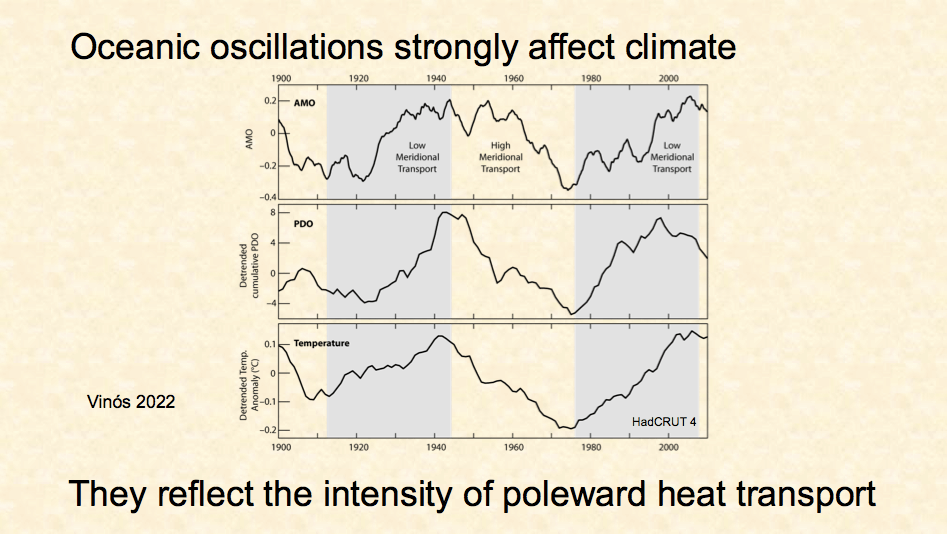
Figure 10. Comparing the Atlantic Multidecadal Oscillation (AMO) to the detrended cumulative Pacific Decadal Oscillation (PDO) and the HadCRUT 4 detrended global average surface temperature anomaly
As was discovered in the 1990s, these oscillations strongly affect global temperature. If we detrend the temperature data (bottom panel in Figure 10), we can see the effect is about 0.3° Celsius.
The IPCC only cares about the trend I removed in the lower part of Figure 10, but that means they assume the oceanic oscillation is stationary, which it is not. It did not have the same amplitude and period during the Little Ice Age. The amplitude of the oscillation got a lot stronger around 1850, when global warming started, suggesting it contributed to global warming.
Then we come to El Niño…
El Niño is part of the heat transport system. When too much heat accumulates in the tropical Pacific, El Niño moves it to the atmosphere.
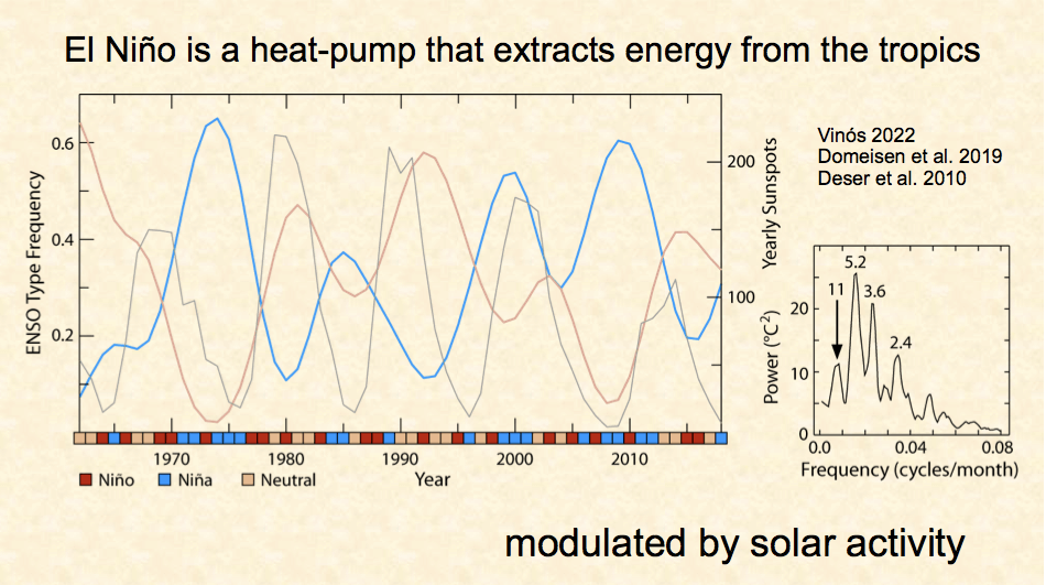
Figure 11. On the left we compare La Niña (blue) to ENSO Neutral (orange), and yearly sunspots (gray). ENSO neutral and La Niña alternate. Sunspot lows normally suggest La Niña. The right panel is a frequency plot of ENSO events
Colored squares in the figure represent the condition for each year. When we analyze the frequency for each condition separately, we discover that the frequency of Las Niñas (in blue) strongly anti-correlates to the frequency of neutral years (in orange). There is no red curve because El Niño frequency is not represented, the gray curve is the solar cycle.
Los Niños take place when sufficient warm water has accumulated, but the rest of the years the decision to be a La Niña or a neutral year is strongly affected by the solar cycle. Neutral years follow solar activity, while Las Niñas do the opposite.
This is reflected in a frequency analysis of El Niño by a peak in temperature change at the 11-year frequency (right-hand panel of Figure 11). The graph is from a 2010 article that does not mention this peak, only the others.
Due to the way solar radiation arrives to the Earth, more energy enters the climate system over the tropics than exits.
Over the rest of the planet, more energy exits the climate system than enters.
To prevent the tropics from continuously warming and the rest of the planet from continuously cooling, heat must be transported poleward.
This heat transport is responsible for what we call weather and the hydrological cycle. Everything happens because there is energy running through the system. On average, energy exits the climate system at a higher latitude than it enters in. as shown in the left panel of Figure 12.
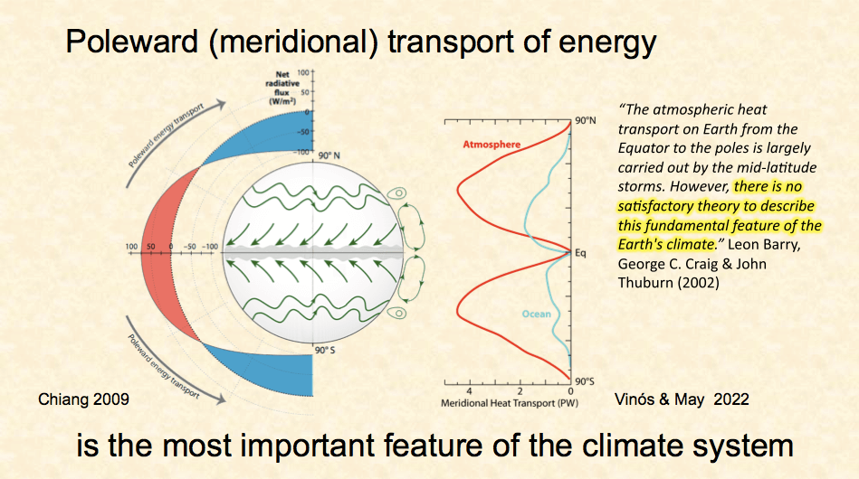
Figure 12. Poleward meridional transport of energy. The right-hand graph shows the split between ocean transport and atmospheric transport. Except in the deep tropics, the atmosphere does most the transport
We do not understand this transport well. Models do a poor job of duplicating it.
The right graph shows how much energy is transported at each latitude. It has this curious shape because the Equator is just a line and very little energy is transported across it, and the poles are just a point that receives very little solar energy. The geometry of the Earth dictates that transport is largest at around 35° because that’s where heat from half of the hemisphere is transported to the other half.
Close to the Equator, the oceans transport most of the heat poleward, but soon after, the oceans transfer this heat to the atmosphere, and at mid-latitudes, the atmosphere does the bulk of poleward heat transport. At high latitudes, the atmosphere is responsible for almost all poleward heat transport.
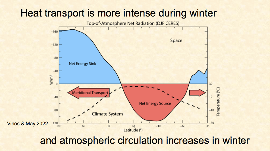
Figure 13. Energy net gain (red) and net loss (blue) by latitude
In Figure 13 we see the net flux of radiation during the northern hemisphere winter at the top of the atmosphere. I have inverted the graph, so the zero line represents the top of the atmosphere, that is the altitude where the Northern Hemisphere winter average incoming energy equals the outgoing energy. The red area is the net energy into the climate system and the blue area is the net energy out of the system towards space. The graph is not corrected for the geometry of the Earth. The dashed line is the temperature profile for the surface in January.
It is clear from Figure 13 that both the bigger loss of energy and the steeper temperature gradient demand a much larger heat transport toward the North Pole at this time of the year.
As a result, the atmospheric circulation, as the primary heat mover, becomes more active during local winter in each hemisphere.
Think of it as a see-saw. Meridional transport and atmospheric circulation go from being strongest during winter in one hemisphere to being lowest six months later.
And this see-saw affects the planet’s rotation speed…
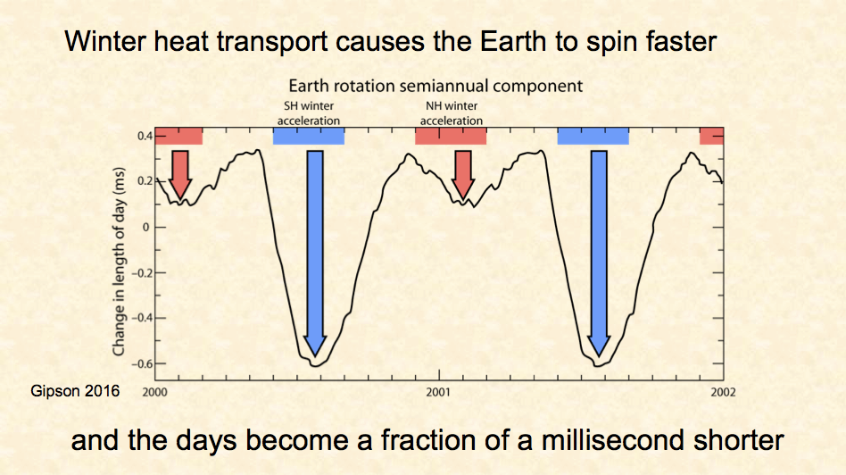
Figure 14. Earth’s rotation speed (as the change in the length of day in milliseconds) from 2000 to 2002. Faster rotation is downward. Southern Hemisphere winters are shown in blue and Northern Hemisphere winters in red
We have been capable of measuring the length of the day with microsecond precision since the 1960s after the invention of the atomic clock in the 50s.
Although the semi-annual change in heat transport is comparable in both hemispheres, the semi-annual change in rotation speed is not, because the distribution of land and ocean between hemispheres is very asymmetric. So, don’t pay attention to the difference in arrow length, as it is not related to the issue.
This semi-annual change in the Earth’s rotation speed is affected by the solar cycle, as shown in Figure 15. This effect has been reported every decade since the 1960s and never refuted, just ignored.
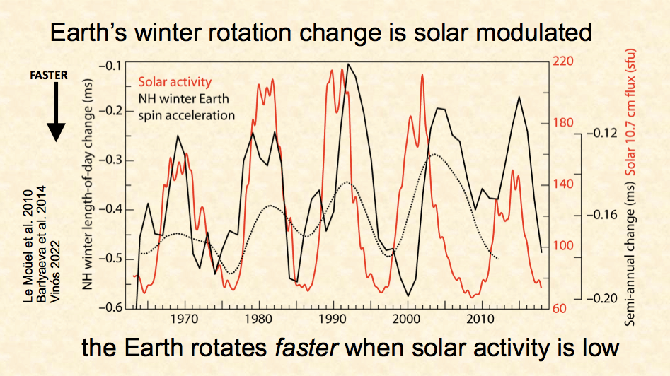
Figure 15. Changes in Earth’s rotation speed is modulated by solar activity
Here I cite 3 reports in the last 12 years and graph two of them. In my book, I measured only the effect during the NH winter which gives the larger effect shown with the continuous black curve. The dotted curve is from Tatiana Barlyaeva et al. using a more sophisticated method over the entire dataset.
To me this is huge. As far as I can remember only Superman was capable of changing the Earth’s rotation. Gravity does, but here we are talking about a tiny change, a tenth of one percent in solar radiation. And yet the IPCC tells us that such small change cannot affect our climate much.
Well, here is the irrefutable proof that it does. The only way solar radiation can change the rotation is by changing the global atmospheric circulation.
When solar activity is low the Earth rotates faster in winter, which implies that it is making atmospheric circulation stronger and transporting more heat poleward. And the opposite happens when solar activity is high.
Scientific evidence shows oceanic oscillations strongly affect climate and meridional transport.
El Niño is also a part of the transport system and is also modulated by solar activity.
Winter atmospheric circulation is modulated by solar activity.
After consulting many thousands of articles, with over 750 of them referenced in my book, I had the radical idea that natural climate change is essentially a change in the transport of energy and that what happens at the poles in winter is the reason we are in an ice age and one of the main reasons the planet has been warming over the past centuries. I called this idea the Winter Gatekeeper hypothesis.
What this hypothesis proposes is that the main natural climate change mechanism at all timescales is a persistent change in the amount of energy transported to the winter poles. At different timescales, different factors affect this meridional transport.
The polar vortex acts as an energy barrier for the winter pole. Its strength regulates how much energy is lost every winter at the poles.
On centennial timescales, solar activity is the main factor regulating meridional transport. It does this by affecting polar vortex strength and winter atmospheric circulation. Solar activity acts through stratospheric ozone, altering the planetary wave flux that ultimately controls polar vortex strength. Thus, the Sun acts on climate like a winter gatekeeper.
Persistently low solar activity causes increased energy loss by the planet, northern mid-latitudes cooling, and Arctic warming. Persistently high solar activity has the opposite effect.
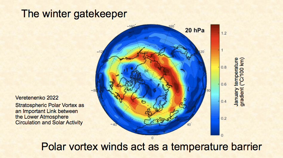
Figure 16. The stratospheric polar vortex in January, as the temperature gradient in degrees C per 100 km. 20 hPa is an altitude of about 23 km or 77,000 feet
Figure 16 is a graphical representation of the winter gatekeeper concept. It shows the horizontal temperature gradient in degrees Celsius per hundred kilometers in the stratosphere during the month of January. Something similar occurs in the tropospheric polar vortex that continues down to the middle troposphere. The area within this barrier is in constant darkness and extremely cold. Little of the heat outside crosses this barrier unless the vortex weakens.
Whatever affects the strength of this barrier constitutes a winter gatekeeper, and the Sun acts as such. Figure 16 is from a recent paper by Svetlana Veretenenko. Her work supports my finding that solar activity affects global atmospheric circulation in part through the polar vortex.
This is an important piece of the winter gatekeeper hypothesis. My hypothesis is more complete, as it includes how this is achieved through stratospheric ozone and the planetary wave flux, and how climate change is about meridional transport and anything that affects it, so the Sun is just a part of the story, although the most intriguing.
Crucial evidence for the winter gatekeeper hypothesis is that solar activity negatively correlates with winter Arctic warming as shown in Figure 17.
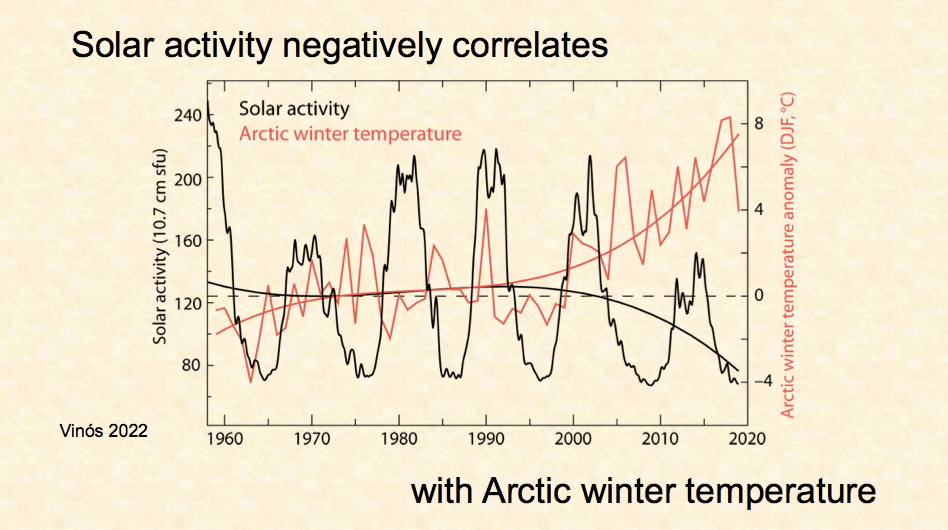
Figure 17. Solar activity negatively correlates with Arctic winter temperature
Global warming strongly accelerated around 1975, after a previous cooling period. Arctic amplification (enhanced warming at the poles) has been a model prediction from the beginning but didn’t start until the mid-1990s. To date, nobody has been able to explain why the strong warming of the late 1970s, the 80s, and the early 90s did not produce it.
A climate shift took place in 1997. As a result, a lot more energy is being lost towards space in the Arctic.
Nearly all the energy lost to space during the Arctic winter is transported there from lower latitudes. That energy has no other place to go but to space, as the energy flux through sea ice is always from the ocean to the atmosphere, frequent temperature inversions make the surface colder than the atmosphere, and radiative cooling is the dominant energy process. By the time the Sun returns that energy is gone forever.
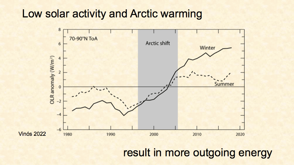
Figure 18. During the Arctic shift between 1997 and 2005, winter outgoing radiation increased dramatically and began to exceed summer outgoing radiation
If you want an explanation for the famous Pause in global warming between 1998 and 2014, you need to look no further. Global warming was deprived of a lot of energy after 1997 by the Arctic shift, and this data indicates the Pause is continuing in 2023, despite the 2015 El Niño heat redistribution.
The effect of solar activity on energy loss in the Arctic is not an over-interpretation of insufficient data. The anti-correlation between solar activity and Greenland temperature goes back at least 2100 years.
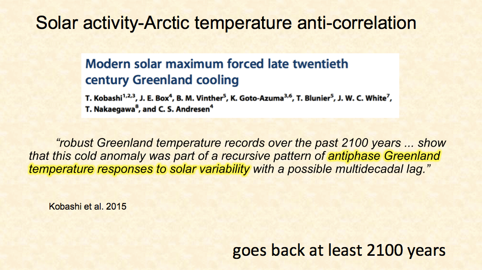
Figure 19. Solar activity-Arctic temperature anti-correlation
The article quoted in Figure 19 was published by well-known authors of very good climate science, like Takuro Kobashi, Bo Vinther, Tom Blunier, and James White.
The article’s title summarizes the study results, but ignores an inescapable conclusion not mentioned anywhere in the article. The end of the modern solar maximum in the twenty-first century is causing Greenland warming.
The diagram in Figure 20 shows how meridional heat transport is affected by different players and how it affects climate.
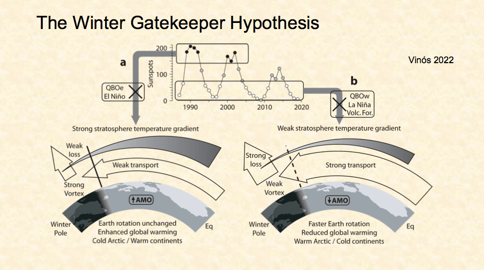
Figure 20. A schematic of the winter gatekeeper hypothesis
When solar activity is high the stratospheric temperature gradient is stronger, favoring a stronger vortex. But this effect can be counteracted by an easterly stratospheric tropical wind (QBOe) circulation or by El Niño, so variability is high.
A strong polar vortex favors a weak meridional transport, and if it coincides with a rising oceanic oscillation (AMO) phase, which also reduces heat transport, the result is enhanced global warming, a cold winter Arctic and warm winter continents, as we had in the last quarter of the 20th century.
When solar activity is low the stratospheric temperature gradient is weaker, favoring a weaker vortex. But this effect can be counteracted by a westerly tropical stratospheric wind (QBOw) circulation, by La Niña, and by volcanic eruptions, so variability is also high.
A weak polar vortex favors strong meridional transport, and if it coincides with a decreasing oceanic oscillation (AMO) phase, that also increases heat transport, the result is reduced global warming or even cooling, a warm winter Arctic and cold winter mid-latitude continents, like we are seeing in the first quarter of the 21st century.
The winter gatekeeper hypothesis provides a good explanation for the surface temperature evolution over the past 120 years, indicating that recent climate change might have a strong natural component.
In this graph, I have removed the vertical axis, and the data is presented after Gaussian filter smoothing to make it simpler.
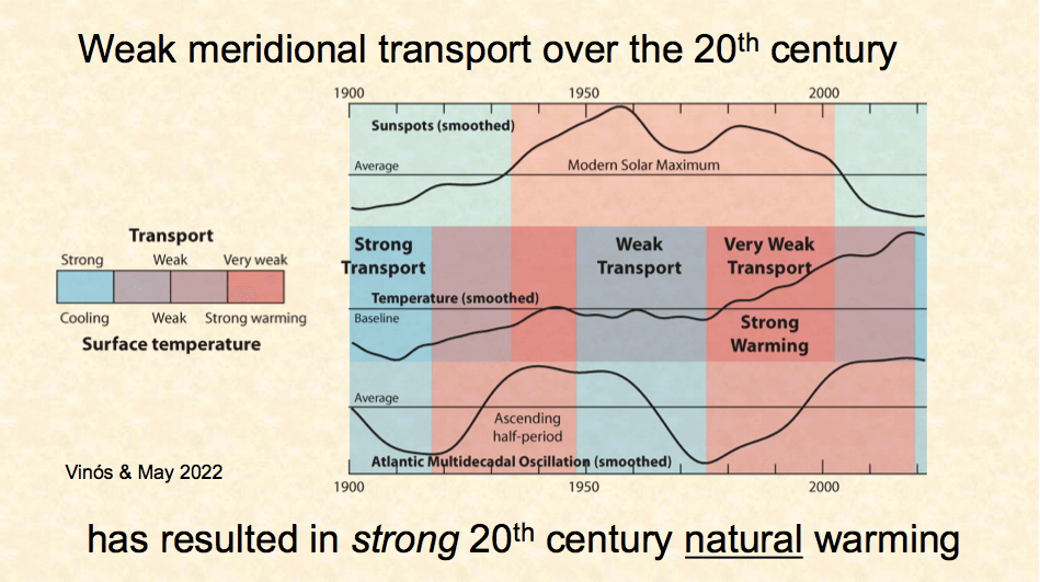
Figure 21. The Modern Solar Maximum compared to global average surface temperature (middle panel), and the AMO or the Atlantic Multidecadal Oscillation
Two of the main factors affecting meridional transport are displayed, solar activity on top, and the Atlantic Multidecadal Oscillation at the bottom. In the middle is the global surface temperature showing early 20th-century warming, mid-20th-century cooling, and late 20th-century warming.
There is a correspondence between heat transport strength and the global average surface temperature, as indicated by the overlapping colors. The data suggests that oceanic oscillations have a stronger effect on transport and surface temperature than solar activity, as seen in the 1920s warming when solar activity was low. But what made the difference for the later 20th century warming period was the modern solar maximum. It strongly increased the warming in the 1940s and in the 1975 to 2000 period. It also reduced the cooling in the 1945 to 1975 period.
This suggests that natural climate change has strongly contributed to global warming. It does not say how much of the warming is natural or how much is human caused. For that, I have no answer.
The winter gatekeeper hypothesis produces a set of predictions that are remarkably opposite to what climate models predict.
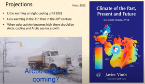
As solar activity is low and the AMO is about to start decreasing, we should expect little warming or even slight cooling until at least 2035.
The 20th century was exceptional in terms of heat transport conditions. We should expect less warming in the 21st century even if CO2 levels continue increasing
When solar activity becomes high again, Arctic cooling and Arctic sea ice growth should occur. Nobody is expecting this and it will be a big surprise when it happens. It might take place in less than two decades.
The science behind this new explanation for climate change from a million years ago to the next glaciation is fully supported by over 750 scientific references in the book I published recently. I priced it very cheap so everybody can have it, but if someone cannot buy it, my book can be downloaded for free from my ResearchGate page.
Since this is complex stuff, Andy May and I are writing a new book to explain this novel global warming hypothesis. We are trying to make it easier for anybody interested in knowing that the science is far from settled.
I was very lucky in knowing Andy May. We have been collaborating for many years. He is a retired petrophysicist with a very good understanding of climate science and a very good writer, an uncommon combination. He has written three books on climate that I fully recommend, and he also writes about history. He has a climate blog here where you can find our joint or separate climate articles, and some of the figures I have shown.
I also want to acknowledge Judith Curry and Peter Webster. Without Judy, my book would have never been published. Her climate blog is where my book took form between 2016 and 18 before the first edition was accepted by Springer. Peter provided very good advice on the second edition.
Willie Soon has encouraged me and helped me over the years. He is a shining light and a role model in climate science.
Anthony Watts has published many of my articles on his site over the years.
And this is the story of my search for natural climate change. Time will tell how successful it has been. But for me, it has been an enlightening trip that I am happy to have shared with you today.
Dr. Javier Vinós

Dr. Javier Vinós has spent decades researching neurobiology and cancer at the Howard Hughes Medical Institute, the University of California, UK’s Medical Research Council, and the Spanish Scientific Research Council. His scientific publications have been cited over 1,200 times by his peers. In 2015 concerns over the effects of the indisputable climate change that is taking place led him to study climate science. Since then, he has read thousands of scientific articles and analyzed data for dozens of climate variables and hundreds of climate proxies.
In 2022 Vinós published the impressive book Climate of the Past, Present and Future: A scientific debate. A free pdf version of the book can be downloaded on his webpage. A hardcover or Kindle version can also be bought at Amazon.

