Nicola Scafetta has just published a new paper in Climate Dynamics examining evidence of the urban heat island (UHI) effect (Scafetta, 2021). The paper is not paywalled and can be downloaded here. In summary, Scafetta shows that part of the recent warming shown in the HadCRUT 4 global temperature record may be due to the UHI effect. He uses an analysis of diurnal maximum (Tmax) and minimum (Tmin) temperatures, climate model output, and a comparison of sea surface temperatures (SST) to land temperatures to estimate the possible influence on the HadCRUT 4 record.
The various land temperature records are not specifically corrected for the UHI effect, instead NOAA and the Hadley Climatic Research Centre rely on homogeneity algorithms to smooth through anomalies. NOAA calls their homogenization process “PHA” and the Hadley Centre’s algorithm is similar, see this post or Menne and Williams’ 2009 article (Menne & Williams, 2009a) for a discussion of temperature homogenization. While these algorithms do lower the temperature in the cities, they also raise temperatures in the rural areas around the cities. To make matters worse, the past 70 years have been a period of rapid population growth and increasing urbanization. The world population has grown from 2.5 billion people in 1950 to 7.5 billion in 2020. The UHI in London has been estimated to be as much as 2.8°C in the summers between 1990 and 2006.
UHI causes Tmin to rise more than Tmax and it causes the diurnal temperature range (DTR) to decrease with time. Scafetta uses the Hadley Climatic Research Unit temperature records (HadCRUT) and the Coupled Model Intercomparison Project 5 (CMIP5) data to examine this problem. He compares an ensemble mean of the CMIP5 Tmax and Tmin data to the HadCRUT data and examines the differences between them.
The CMIP5 models have been tuned to the HadCRUT global and regional anomalies, so local anomalies, like UHI may be visible in maps of the difference between the two datasets. The CMIP5 models do not parameterize cities, so differences over cities, and surrounding areas, might indicate UHI influence remaining in the HadCRUT record.

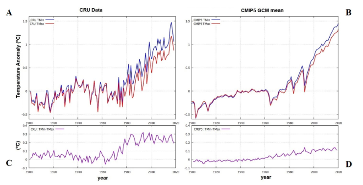
Figure 1. These are the global Tmax (red) and Tmin (blue) anomalies from HadCRUT (A) and CMIP5 (B). The differences are shown in C and D. Source: (Scafetta, 2021).
Figure 1 compares the global Tmin (blue) and Tmax (red) anomaly records from HadCRUT4 to the CMIP5 ensemble mean values that Scafetta used in his study. The records are anomalies from 1945-1954. Comparing the decades 1945-1954 and 2005-2014, the Tmin-Tmax (DTR) differences are different. The HadCRUT4 DTR is 0.25 and the CMIP5 DTR is 0.1. In both cases Tmin warmed more than Tmax.
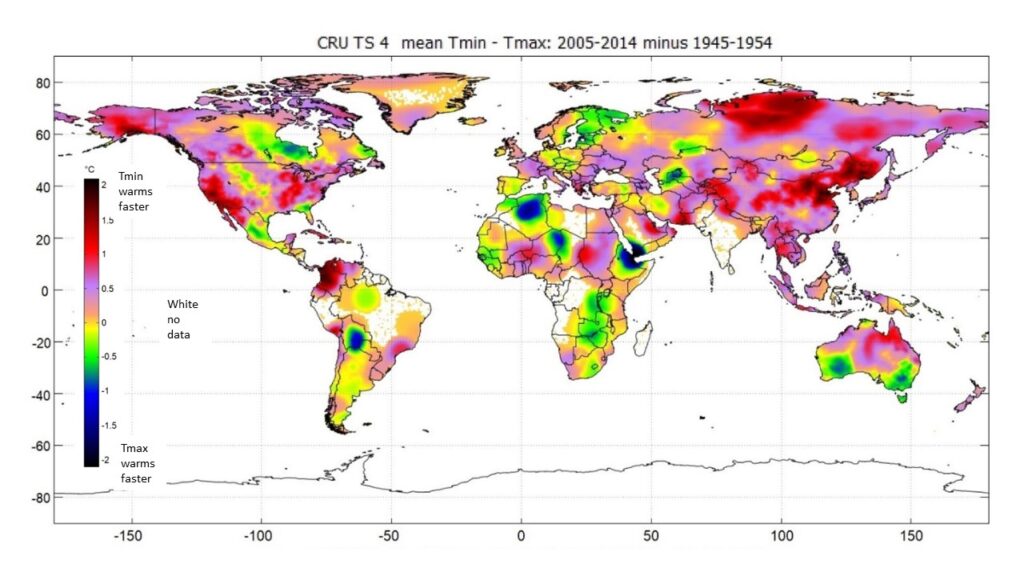
Figure 2 shows how the Tmin-Tmax anomaly differences are distributed in the HadCRUT4 dataset.

Figure 2. Global distribution of HadCRUT Tmin-Tmax anomalies (DTR). Orange, purple and reds mean that Tmin is warming faster than Tmax. White areas, including the oceans have no Tmin and Tmax data. (Scafetta, 2021).
As you can see in Figure 2, most of the land areas show a positive value, meaning Tmin is rising faster than Tmax. The HadCRUT data shown in Figure 2 show that large areas in North America and Asia have Tmin increasing much faster than Tmax. This is most apparent in the rapidly urbanizing China and in the growth areas of the United States and Canada.
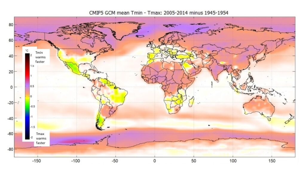
In Figure 3 we see how the CMIP5 ensemble Tmin -Tmax (DTR) anomalies are distributed. The modeled Tmin-Tmax anomalies are much more subdued and closer to zero than the measured and homogenized values.

Figure 3. Global distribution of CMIP5 Tmin-Tmax anomalies (DTR). At the poles, the far north, and parts of Asia and central Africa show Tmin is warming slightly faster than Tmax. Most of the rest of the world is near zero, including the oceans. (Scafetta, 2021).
Only near the poles do the models show much of an increase in Tmin-Tmax, along with scattered areas in Asia and Africa. Greenland is a large island with a very small population, ~56,000 people, and it shows little difference between the modeled values and the measured values. The actual values vary from -0.2 to 0.2 and the modeled values are between 0 and 0.2.
Scafetta shows with numerous examples “that the land climatic record is affected by significant non-climatic biases.” Tmin and Tmax do not exist in the SST (sea surface temperature) records, but we can compare the SST records to the HadCRUT land records via the CMIP5 model ensemble. When this was done, Scafetta found that, after accounting for the thermodynamic differences between land and ocean, the CMIP5 simulations match the warmer land records, but significantly overestimate the SST. A land simulation of the temperature difference between the 1940 to 1960 average and the 2000-2020 average showed a model to HadCRUT difference of only 0.06°C. Comparing CMIP5 (+0.69°C) to HadSST (+0.41°C) over the oceans, showed a warming of 0.28°C, which is five times higher.
The land temperature warming according to HadCRUT is about one degree from the 1940-1960 period to the 2000-2020 period. If the CMIP5 models and HadSST records are accurate, then the land records have a bias of +0.36°C. This is almost a 60% error. We have discussed the large impact of corrections on the temperature record before, see this post for more on the topic.
Discussion
Scafetta’s study shows a potential systemic bias in the land HadCRUT records. Most of the bias, as shown in Figure 2, is in areas with rapid urban development over the study period of 1940 to 2020. There are other anomalies, the notable one in Bolivia may be due to rapid deforestation in that area. The anomalies in arid parts of North Africa may be due to a reverse urban effect, since in these area’s urbanization may create a cooler area, relative to the surrounding rural areas.
All the data used in the study has error. Definitive conclusions cannot be drawn. But it does seem that the land portion of the HadCRUT 4 record is warmer than it should be, relative to SST. It is also likely that this warm bias has leaked into the CMIP5 models. Recent DTR values (Tmax-Tmin) have decreased more than the CMIP5 models have predicted. This could be a problem with the models in urban areas, or it could be due to the homogenization algorithms used by the Hadley Climatic Research Centre smearing urban heat island warming over large areas. Either way, Scafetta has shown that these datasets are not consistent and, one or more of them, may contain significant systemic bias.
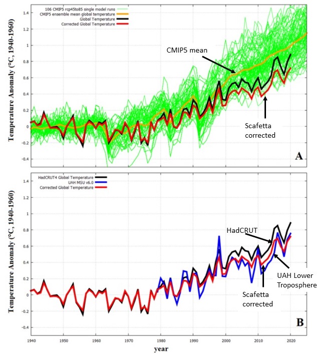
One final point. When the data is corrected for the apparent bias described above, and compared to the independent lower troposphere UAH global mean temperature (Spencer, et al., 2017), we see that the corrected HadCRUT record is closer to it than the original, which is in black, in Figure 4B. This comparison shows that the apparent bias detected by Scafetta’s study has some empirical support.
Figure 4A compares the original HadCRUT 4.6 record, in black, to Scafetta’s corrected one in red. The CMIP5 model ensemble mean, in yellow, is shown along with 106 independent model runs in green. Figures 14A and 14B use the same colors. Figure 14B adds the UAH global lower troposphere average temperature in blue. All curves are anomalies to the 1940-1960 period.
Relative to 1940 to 1960, the original HadCRUT curve shows 0.59°C of warming and 0.48°C using Scafetta’s corrections. The UAH record shows 0.44°C. The CMIP5 climate models show 0.78°C of warming.
It is possible, according to Scafetta’s correction, that non-climatic biases may have contributed a fifth of the reported HadCRUT global warming since 1940-1960. It is also possible that the CMIP5 climate models may overestimate warming by a third. These are significant problems.

Figure 4. Graph A shows the individual model runs in green the CMIP 5 mean in yellow, the HadCRUT record, uncorrected in black, and the corrected HadCRUT record in red. B shows the same HadCRUT corrected record in red, the UAH lower troposphere record in blue and the original HadCRUT record in black. The red and black lines in A & B are the same.
Works Cited
- Menne, M., & Williams, C. (2009a). Homogenization of Temperature Series via Pairwise Comparisons. Journal of Climate, 22(7), 1700-1717. Retrieved from https://journals.ametsoc.org/jcli/article/22/7/1700/32422
- Scafetta, N. (2021, January 17). Climate Dynamics. Retrieved from https://doi.org/10.1007/s00382-021-05626-x
- Spencer, R., Christy, J., Braswell, W. (2017), UAH Version 6 global Satellite Temperature Products: Methodology and Results, Asia-Pac J Atmos Sci 53:121-130.

Andy May, now retired, was a petrophysicist for 42 years. He has worked on oil, gas and CO2 fields in the USA, Argentina, Brazil, Indonesia, Thailand, China, UK North Sea, Canada, Mexico, Venezuela and Russia. He specializes in fractured reservoirs, wireline and core image interpretation and capillary pressure analysis, besides conventional log analysis. He is proficient in Terrastation, Geolog and Powerlog software. His full resume can be found on linkedin or here: AndyMay
