
Figure: AR6 hockey stick
“Climate change is accelerating”. With these words, the 8 o’clock national news started last week. The reason: the new, sixth IPCC report. Various media published similar statements. Leftwing newspaper De Volkskrant: “UN panel IPCC: climate change is accelerating, man is ‘unmistakably’ the cause”. Only De Telegraaf dared to let some critics speak, including yours truly: “Scientists: extreme scenarios not realistic”.
Hyperboles were in short supply to express the urgency of the ‘climate problem’. UN Chief Gutteres even went to the extreme of calling it code red for humanity.
Every IPCC report is accompanied by this kind of ritual dance. The IPCC itself declares in somewhat woolly language (because the IPCC is officially policy neutral) that it is 2 minutes to 12 after which activists, politicians and the media go wild and declare that it is already 2 minutes past 12. This time it was no different.
Now that the media hype around the report has subsided somewhat, it is time to take a calm look at some of the claims in the new IPCC report and also at what the IPCC leaves unsaid or gives less attention to in its Summary for Policy Makers (SPM). I made a first attempt last week in an interview in the popular Studio BLCKBX: “Alarmist IPCC report offers hope” (in Dutch but with English subtitles).
Hockey stick
Back to the opening words in our national news program: “climate change is accelerating”. Most people will let these words pass almost without thinking and will assume “it must be true”. For insiders like me, however, this new conclusion in the IPCC report was downright surprising! The claim is based on a brand new hockey stick graph (the graph at the very top of this article). This graph was the opening graph in the Summary for Policy Makers. So it is a piece of evidence that the IPCC wanted to give a lot of attention. Coupled with yet another graph – with which the IPCC claims to ‘prove’ that the warming since 1850 is mainly due to greenhouse gases – the message was the following: “due to human influence (read: CO2 and other greenhouse gases), the earth has warmed at a rate unprecedented in the last 2000 years”.
Without exaggeration, I would not be writing this article now if, way back in 2004, when I worked at the popular science monthly Natuurwetenschap & Techniek, I had not been asked by my chief editor to write an article about “a hockey stick graph”. It became the beginning of a two-month quest that ended with a long article (English version here) in which the hockey stick graph in the third IPCC report in 2001 was smashed to smithereens by two Canadian researchers (Stephen McInytre and Ross McKitrick). This experience and especially the reactions to it from the field (the unwillingness to acknowledge the criticism of McIntyre and McKitrick) triggered me to start investigating more climate claims, which eventually led to the publication of my book (in Dutch) De Staat van het Klimaat.
The controversy surrounding the hockey stick, especially to be found on Stephen McIntyre’s blog climateaudit.org was a central theme in the climate debate for years. It was ultimately also the cause of climategate, an affair in which thousands of e-mails from prominent IPCC authors were hacked and put online. The emails were examined by various committees of enquiry but were ultimately dismissed as a storm in a teacup. But in my book, I show that several emails do shed a very questionable light on the integrity of the IPCC authors involved.
In any case, there is even a hefty book on this matter written by Andrew Montford and it would be going too far to go into it all again. After climategate, all those closely involved became fed up with the subject. And in the fourth (2007) and fifth (2013) IPCC reports, the IPCC did not publish a prominent hockey stick either. But lo and behold, in the sixth IPCC report the hockey stick is back in all its glory. Or as McInytre puts it: “the IPCC is addicted to hockey sticks”.
Where does this attraction to the hockey stick come from? A long time ago, in 1995, a climate researcher once wrote: we have to get rid of the Medieval Warm Period. There is much historical evidence that around the year 1000 it was also warm on Earth. The Vikings went to Greenland, called it Greenland (and not e.g. Iceland), farmed there and managed to survive for several centuries. This kind of information is unwelcome (for the IPCC) because this warm period suggests that even without CO2 emissions it was warm on Earth in the recent past. How warm exactly? Warmer than now? And if so, what caused the warming? There is no simple answer to these questions, but with the introduction of hockey sticks the IPCC suggests there is. Take a closer look.

Temperature reconstruction of the last 2000 years. Source: sixth IPCC report
The graph shows the ‘temperature’ on earth over the last 2000 years. From 1850 onwards there are also temperature measurements with thermometers (the darker line labelled ‘observed’). The lighter part of the reconstruction is based on indirect temperature measurements (so-called proxies) derived from, among others, tree rings, ice cores, corals and sediment layers in the oceans. The researchers behind this new hockey stick (united in a group that calls itself Pages2k) bundle all these indirect measurements into a global average temperature. And what does their reconstruction tell us at first glance? The climate was very stable between the year 1 and the year 1000, the centuries after that there was a slight cooling (this period is known as the Little Ice Age) and from 1850 onwards the warming accelerated. The current warming is unprecedented, a favorite word of the IPCC, seen over the last 2000 years. And according to the same figure, it is now also warmer than during the so-called Holocene Thermal Optimum, a period roughly 11.000 to 7000 years ago, when historical evidence also suggests temperatures were quite high.
So what has been the criticism over the years from insiders such as McInytre, who, like a true forensic researcher, has scrutinized such reconstructions? Two things: cherry picking of data and misapplied statistics. The second quickly becomes quite technical but the first is easy to understand. Investigators have databases in which the results of proxy research are stored. Which data will you now use for a new reconstruction? What are your criteria? It is tempting to say: only those proxies that correlate well with the measured temperature in the 20th century are ‘suitable’ proxies. After all, in that period, we can calibrate the proxies to the actual measured temperature. But now comes the problem: most of the proxies do not show any increase (translated as temperature rise) at all in the 20th century. Here are some proxy time series that McInytre published on his website last week in response to the IPCC report that just came out:
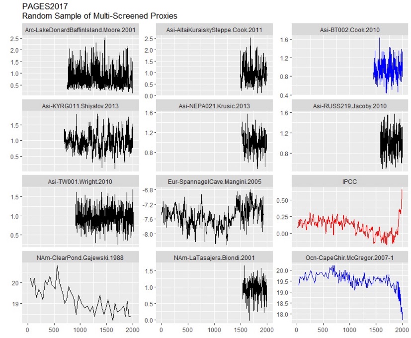
Eleven proxy time series chosen at random by McIntyre from the Pages2k 2017 network. In blue the proxies that were subsequently carried over to Pages2k 2019. In red, for comparison, the new IPCC hockey stick. Source: ClimateAudit.org
The majority of proxies show no increase at all in the 20th century. Is that problematic? Yes, because a proxy is assumed to have a linear relationship with (local) temperature. So one could conclude that the majority of proxies are not usable at all, thus making this kind of temperature reconstruction impossible.
The only one of the 11 proxies that shows a clear hockey stick in the 20th century is (in blue) an alkenone proxy from Cape Ghir (off the coast of Morocco). This hockey stick does not go up, however, but down spectacularly, suggesting cooling. McIntyre describes this drop as a riddle. But instead of solving this riddle, the Pages2k researchers chose to set up their statistical program so that the drop was simply mirrored in a rise. And then they decided to carry this proxy into their next reconstruction in 2019 (Pages2k 2019), the reconstruction on which the new hockey stick is based. It is hard to believe that the researchers actually did this, let alone that they could get away with it with the reviewers (both those of the scientific journals and those of the IPCC report). But that appears to be the case. And McIntyre describes that it is not the first time researchers have flipped a falling proxy to an increasing one.
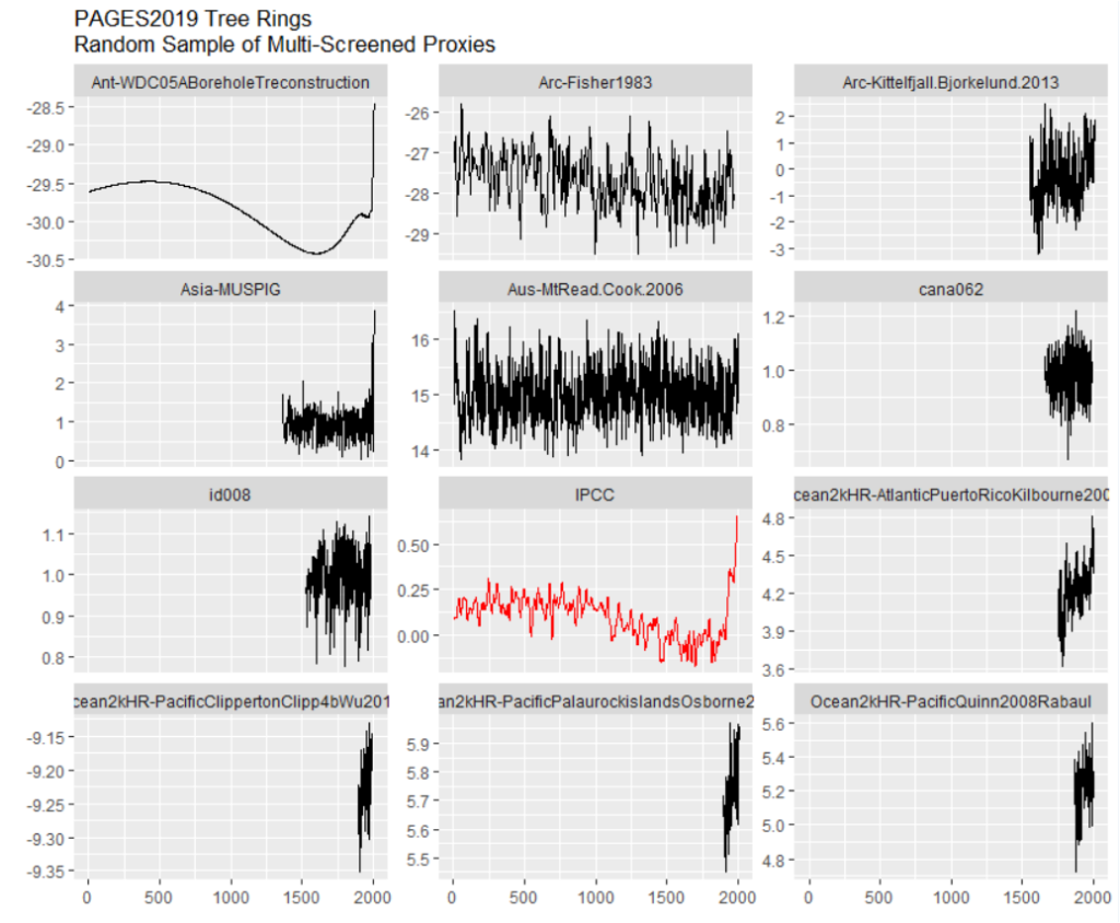
Second randomly selected set of proxies, this time from the Pages2k 2019 study, the network also used for the IPCC hockey stick. Source: ClimateAudit
In the second set of proxies that McIntyre randomly selected, there are again many proxy series that are very short and do not go back to the year 1000 let alone the year 0. So how can these proxies say anything about whether it is warmer now than it was over the past two millennia? Again, most don’t show much in the 20th century, but two do.
One of them, second row on the left (Asia Muspig), is based on tree rings. McIntyre describes how, in 2019, he managed to obtain the underlying data of these tree rings and how he then used a standard operation to convert these tree-ring thicknesses into a ‘temperature series’. This looked like this:
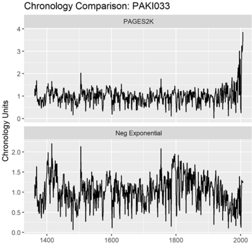
Above, the series as used by Pages2k. Under, McIntyre’s calculation based on a standard processing method.
Another mystery. As can be seen in the bottom figure, these tree-ring data do not show a hockey stick after processing by McIntyre. But in the Pages2k version they do. How is this possible? McIntyre has no idea either.
Even more spectacular is the hockey stick shape on the top left, based on a borehole in Antarctica. Here the temperature in the drill core is a proxy for the temperature in the past. McInytre tells how, a few years ago, he managed to obtain the code with which this data had been processed. It turned out that the top 15 metres of the borehole had not been included. What would the data have looked like if it had been?
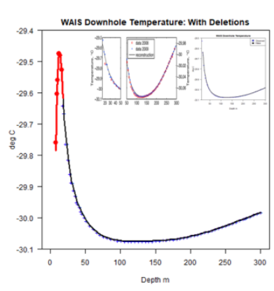
Archived data from the borehole reconstruction in Antarctica, including the data (in red) from the top 15 metres.
McIntyre was able to retrieve the archived data, including the part of the upper 15 metres, shown above in red. Not surprisingly, this section goes down and, if included in Pages2k, would have led to a 20th century decline. This brings to mind the most infamous passage from the climategate emails in which IPCC researchers discuss “hide the decline”, the omission of a declining curve after 1960 in the IPCC report, because it could only lead to confusion.
McIntyre describes other research showing that the upper metres of the West Antarctic ice sheet are subject to huge seasonal fluctuations. So one can legitimately question the last part of the graph. But then why include 15 metres and not, say, 20 metres, which would make the upward peak in the 20th century much smaller.
This arbitrariness in hindsight worries McIntyre the most. The danger of cherry picking is, of course, very great. Suppose you are testing a new drug. Researchers prefer to do this in a double-blind randomised way. So neither the researchers nor the patients know who gets the drug and who gets a placebo. In advance, you determine the number of patients you are carrying out the study with and the outcome you are going to test (complaints, hospital admissions, mortality, events (e.g. heart attack), etc.). Of course, you cannot select 100 patients afterwards who have benefited greatly from the drug and then say, on the basis of those 100 patients, ‘you see, the drug works’.
However, this is the kind of approach used by researchers who make this kind of temperature reconstruction. After the data have been collected and put into a database, researchers determine which series they consider suitable for making a reconstruction. And researchers are rarely transparent about this selection. Or as McIntyre writes: researchers rarely show the underlying data in their papers.
The new hockey stick is therefore mainly old wine in new bags. The Pages2k 2019 reconstruction is presented as a ‘new’ reconstruction, but many of the active ingredients (i.e. sequences that exhibit a strong hockey stick shape) have been used many times before, such as the infamous American bristlecone pine tree rings that were already in Michael Mann’s infamous hockey stick in 1998.
For sceptics it is tempting to contrast the hockey stick with another reconstruction, one in which the Middle Ages were much warmer and in which the Little Ice Age is much more pronounced. An example is Loehle’s 2007 reconstruction:
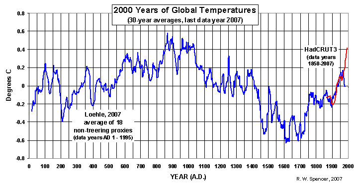
Temperature reconstruction over the last 2000 years, based on proxies, excluding tree rings. Source
However, the same danger lurks here. The maker of the reconstruction chooses those proxies that fit into the image he wants to conjure up of the past. For this reason, McIntyre himself has never made his own reconstruction. But he states that one cannot do much more than look at local indications. For example, the tree line in a certain area and how it has fluctuated in the past can say something about changes in the local climate over the centuries.
Sebastian Lüning, author of the German book Die Kalte Sonne (English edition), is also reluctant to make one global reconstruction based on so many different proxies from so many different areas of the globe. Lüning, who himself regularly publishes on the basis of proxy data, decided to take a different approach. He searched the worldwide literature for papers that say something about the year 1000 in a certain area. He then coloured the results on a world map: red for warm around the year 1000, blue for cool, yellow for dry and green for wet. The result looks like this:
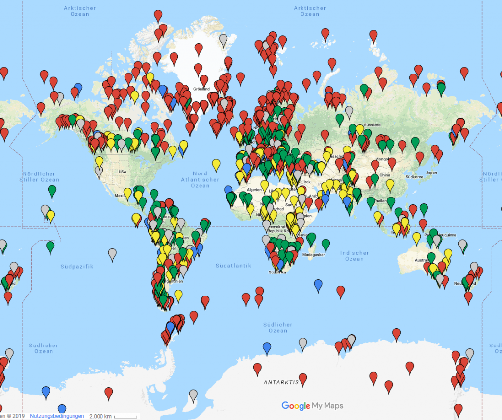
Results Medieval Warm Period project, source Die Kalte Sonne
Each dot is thus linked to a scientific study that relates to the area in question. Lüning has incorporated more than 1200 studies into his map. What is striking is that red is indeed dominant over blue. This is true worldwide. So at the very least the picture is created that the Medieval Warm Period were indeed a worldwide phenomenon and not limited to Greenland and Europe, as supporters of the hockey stick often suggest. But whether it was actually warmer in the Middle Ages than it is now, is not indicated by this map either.
Is it all that relevant? Yes and no. McIntyre regularly points out – especially on twitter these days – that prominent mainstream researchers themselves claim that the hockey stick “doesn’t matter”. If that is so, he wonders aloud, then why can IPCC researchers repeatedly not resist the temptation to come up with a new hockey stick?
It is relevant though in the sense that we would like to know how variable the climate was before humans started to emit CO2 en masse. Because that variability may say something about what the IPCC calls the internal variability of the system. Now, modelers will try to simulate the ‘flat’ climate between 0 and 1900 with their models. This is perfectly possible with a model that has little internal variability and that will only rise or fall when CO2 (or the sun) rises or falls. But what if the climate has much greater dynamics, even without these kinds of external influences? And models do not know how to capture this? How can we then know that models simulate the climate in the twentieth century correctly?
So now that the IPCC has come up with a new hockey stick, the discussion about it is bound to flare up again, although it is not expected to get any bigger than in 2005 (criticism McIntyre and McKitrick) and 2009 (climategate).
At Clintel we will try – partly with the help of McIntyre – to find out more about the new hockey stick in the coming weeks. This is part of our project to review the new IPCC report with an international team of people. The support for this research so far has been heartwarming. You can still contribute via the page on which the project is described.
This is the first article in a series about the new IPCC report. In the coming weeks, articles will follow on extremes (are they increasing or not?) and on the scenarios (are the higher scenarios realistic?). Don’t miss these next articles and subscribe to our newsletter.
Finally, back to the national news and their “climate change is accelerating”. Is this claim justified? My opinion: probably not. Can they be blamed for bringing this news? Of course not. It is the IPCC itself that has once again made this bold claim in its quest to label the current warming trend as exceptional. It would be nice if more journalists would take a critical look at this. But for the time being, that seems to be vain hope.
