By Steve McIntyre
Original post here
Although climate scientists keep telling that defects in their “hockey stick” proxy reconstructions don’t matter – that it doesn’t matter whether they use data upside down, that it doesn’t matter if they cherry pick individual series depending on whether they go up in the 20th century, that it doesn’t matter if they discard series that don’t go the “right” way (“hide the decline”), that it doesn’t matter if they used contaminated data or stripbark bristlecones, that such errors don’t matter because the hockey stick itself doesn’t matter – the IPCC remains addicted to hockey sticks: lo and behold, Figure 1a of its newly minted Summary for Policy-makers contains what else – a hockey stick diagram. If you thought Michael Mann’s hockey stick was bad, imagine a woke hockey stick by woke climate scientists. As the climate scientists say, it’s even worse that we thought.
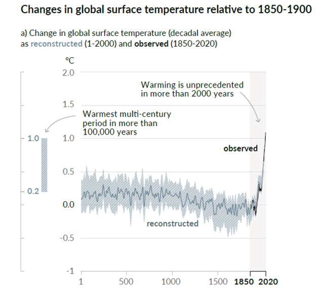
Curiously, this leading diagram of the Summary of Policy-Makers does not appear in the Report itself. (At least, I was unable to locate it in Chapter 2.) However, it is clearly the progeny of PAGES2K Consortium (Nature 2019) and Kaufman et al (2020), both of which I commented on briefly on Twitter (see here).
It’s hard to know where to begin.
The idea/definition of a temperature “proxy” is that it has some sort of linear or near-linear relationship to temperature with errors being white noise or low-order red noise. In other words, if you look at a panel of actual temperature “proxies”, you would expect to see series that look pretty similar and consistent.
But that’s not what you see with the data used by the IPCC. You’d never know this from the IPCC report or even from the cited articles, since authors of these one- and two-millennium temperature reconstructions scrupulously avoid plotting any of the underlying data. It’s hard for readers unfamiliar with the topic to fully appreciate the extreme inconsistency of underlying “proxy” data, given the faux precision of the IPCC diagram.
Many of the series discussed in this post, including nearly all of any HS-shaped series, have been previously discussed in Climate Audit blog posts (tag/pages2k) from 2, 5, 10 or even 15 years ago or in tweets from 2019 and 2020 (see here).
The PAGES2019 is not a “random” selection of proxies, but winnowed through ex post criteria. As Rosanne d’Arrigo explained to the NAS panel many years ago: if you want to make cherry pie, you first have to pick cherries.
The PAGES2019 dataset consists of 257 proxies, selected from the prior PAGES2017 dataset consisting of 692 proxies, which had previously been selected from thousands of proxy series accumulated by many authors over the years.
In order to give readers an overview of the underlying data – not the massaged final product, I’ve plotted three batches of 11 randomly selected series from each of PAGES2017, PAGES2019 and then PAGES2019 North American tree rings and then commented on each batch. (The samples were selected by R formula sample(1:K, 11) where K is the size of dataset being sampled.) In each case, there were usually series that I had already studied plus numerous non-descript series, which are notable and important to show precisely because the majority of proxies are non-descript and you need to see this to understand it.
This post will be a work in progress for a few days, as I have some sections on special issues that I will try to add as I have time.
A First Batch: PAGES2017 Proxies
As a first illustration, below is a random sample of 11 PAGES2017 series. The series carried forward to PAGES2019 are in blue. For reference, the IPCC curve is shown in red. As you can easily see, most of the series are non-descript and short. Only one series in this sample (Cape Ghir temperature alkenones) has a hockey stick shape, but it goes down.
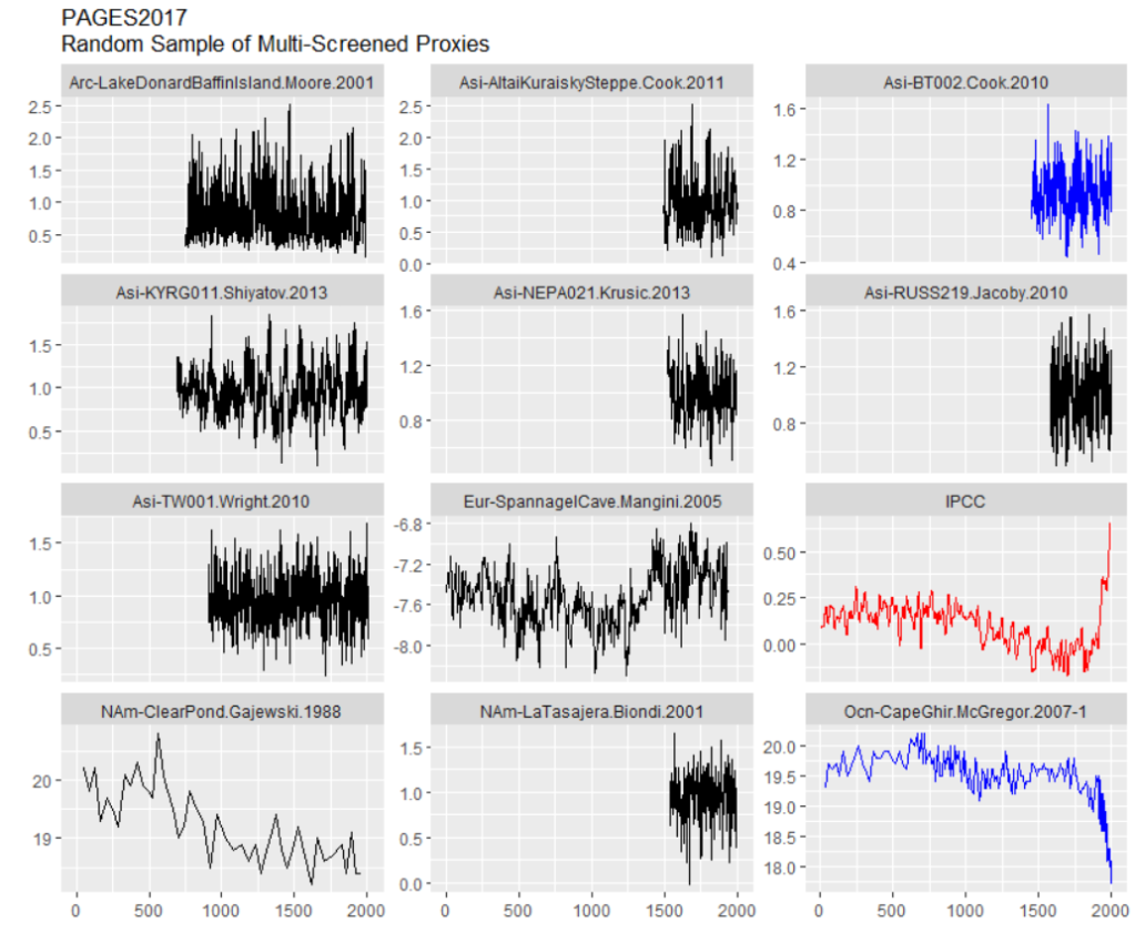
The Cape Ghir series, shown above, is in deg C, but has an obvious problem: it goes down. (See prior Climate Audit discussion of Cape Ghir alkenone series here). And this is not a case where the raw proxy measurement has an inverse relationship to temperature (e.g. coral Sr or coral d18O), but a case where the temperature estimate from the proxy goes down. Alkenones are a very unique proxy because there are widely accepted formulas for converting alkenone measurements directly to deg C. Alkenones are widely used to estimate ocean temperature in deep time, yielding consistent estimates for millions of years. This is totally different than tree ring measurements, where ring widths have first to be adjusted for age and location, prior to trying to develop an ad hoc local formula to estimate local temperature from a sort of average of ring widths.
Precisely why local Cape Ghir (offshore Morocco) temperatures were going down is somewhat of a quandary. Rather than figuring out this quandary, Neukom and the woke just turn the series upside down, following the example of Upside Down Mann by orienting the series according to its correlation with target instrumental temperature, even in their “CPS” reconstruction – a technique that is normally resistant to opportunistic flipping of proxies to enhance HS-ness of a final reconstruction.
Watch what Neukom et al did with their “CPS” method:

CPS (to my knowledge) in all prior reconstructions by non-woke authors is an average of scaled data that has been oriented ex ante by known properties of the proxy. I.e. it won’t flip over an alkenone temperature estimate simply because it goes the wrong way. But this salutary property is not maintained in Neukom’s bastardized implementation of CPS – a bastardization that ought to have been resisted by reviewers somewhere along the line. PAGES2K produced temperature reconstructions by seven different methods, all of which yielded somewhat similar results to CPS – strongly suggesting that these other methods also flip series like Cape Ghir.
A Second Batch: PAGES2019 Proxies
Here’s a second random sample of proxies, this time all from the additionally screened PAGES2019 subset. Take a look, comments below.
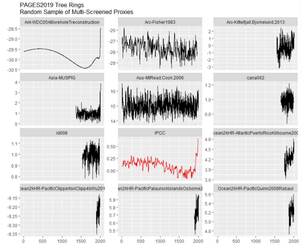
It’s not as though PAGES2K made a composite from 257 series that are two millennia long, all or a majority having a HS shape. One series in this sample does look a lot like the IPCC stick and will be discussed at length below, but the others look very different.
Four of the series in the sample are very short – three of them are actually shorter than the instrumental record. These are all coral Sr or coral d18O series, which make up 25% of the PAGES2019 data set. The extremely short records illustrated above are typical, indeed almost universal, in this class of proxy. They do have a pronounced trend in the instrumental period. This contrasts with the lack of trend that one sees in the two long proxies in the middle column above – a tree ring series from Mt Read, Tasmania (also used in MBH98) and a 1983 ice core series by Fisher from Devon Ice Cap on Baffin Island (also available to 1990s vintage multiproxy studies).
The short coral series do not contribute information to the medieval and earlier periods which one is trying to compare to the modern period. So what is their function? Do they contribute anything other than painting a moustache on the non-descript longer series?
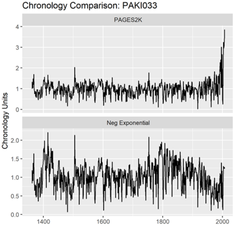
The tree ring series in this sample are rather short; the screening procedures have somewhat concentrated series with slight upticks. (The stripbark bristlecone chronologies that were so prominent in the Mann et al Hockey Stick continue to be used in PAGES2019 – as discussed below.) I discussed the series in the left column with large uptick (Asi_MUSPIG aka paki033) in a 2019 tweet thread here. I located the underlying ring width measurements at NOAA and re-calculated the tree ring “chronology” using standard methodology – see below. The high-frequency details match, showing that the underlying measurement data is apples-to-apples. No chronology from original authors is archived at NOAA: so how did PAGES2K manage to get such a hockey stick? I have no idea.
The most “interesting” series in this sample batch is the borehole temperature reconstruction that has such an uncanny resemblance to the eventual IPCC reconstruction. By coincidence (or not), I wrote about this borehole temperature reconstruction (from WAIS Divide, Antarctica) in February 2019, a few months before publication of PAGES 2019 – see here – scroll down – for a more thorough analysis.
I’ve written multiple posts on the mathematics of borehole inversion calculations, which purport to estimate temperatures for thousands of years into the past from modern day temperatures measured downhole. These calculations require the inversion of a multicollinear matrix (with determinant close to 0). As far as I’m concerned, nearly all the details that specialists pontificate about are a sort of Chladni pattern artifact.
But that’s another story. Here the problem was much stranger. A few years earlier, I had (circuitously) managed to obtain a copy of the code used to calculate this borehole inversion (which is not archived anywhere.) The code showed that they had deleted the top 15 meters of the core from their calculation.

I’ve had a LOT of trouble getting the underlying borehole temperatures for some famous series. (The 2006 NAS panel cited one such result, but the original author (a US government employee) refused to make the data available, and, to my knowledge, it remains unavailable.) However, in this case, the underlying downhole temperatures had been archived, including the values had been deleted. Needless to say, they went down. An inversion using all the data would not have resulted in the impressive Hockey Stick in the PAGES2019 dataset, but a substantial recent decline.
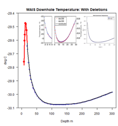
Prima facie, another example of “hide the decline”.
To be fair, as I observed in the earlier post, there is a dramatic seasonal fluctuation in temperatures in the top portion of the Antarctic ice sheet, which makes the already formidable (and probably impossible) inversion problem even more intractable. In my Feb 2019 post, I showed a diagram from van Ommen et al (1999) which showed the dramatic changes in downhole temperature as the seasons changed: a sort of damped sinusoidal pattern can be discerned. In the top 15 meters of the core, seasonal changes dominate.
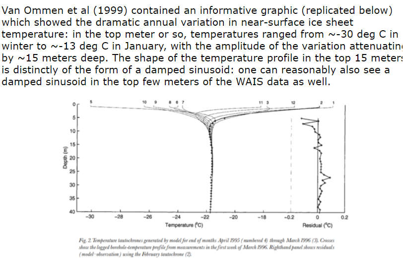
Note that the blade on the hockey stick in this IPCC series is entirely dependent on the choice of 15 meters as a cutoff point for the borehole inversion. A choice of 20 meters would have probably eliminated the blade altogether.
The fact that the top portion of the core has to be excluded because of seasonal effects also creates a strange irony: the layers at 15 meters at WAIS date back to the 1960s. So IPCC has ended up relying on a series that purports to reconstruct temperature up to 2007, but without using any of the ice core dating from ~1965 to 2007. The calculation is entirely done from ice core layers dated prior to the 1960s. Does this seem reliable to any of you? Doesn’t to me.
Furthermore, the WAIS Divide borehole temperature reconstruction yields a totally different result than the widely replicated and well understood d18O isotope series.
Given the questions and defects surrounding the WAIS borehole inversion series, it is absurd that this series (a singleton, to boot) should be used in a policy-relevant document. That the final IPCC diagram is so similar to this garbage series also makes one wonder about what is happening under the hood of the multivariate calculations.
A Third Batch: PAGES2019 North American Tree Rings
North American tree rings (including some Arctic series) make up ~25% of PAGES2019 proxies. Here’s a random sample.
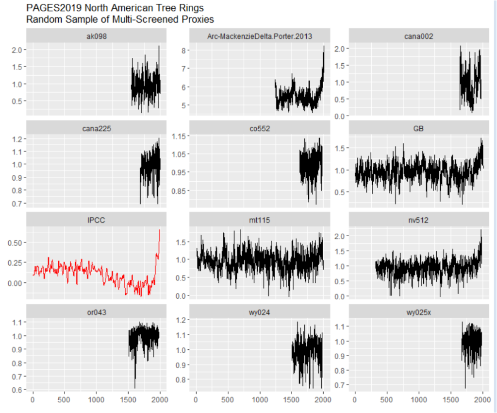
The majority are short and rather non-descript – nothing like the final IPCC diagram.
There are one series with an enormous hockey stick: Mackenzie Delta (Porter 2013); and two series (“GB [Great Basin]” and nv512) with noticeable closing upticks. Sharp-eyed readers may have already figured out some of this story.
I discussed the Mackenzie Delta super-stick of Porter et al (2013), a new entry to hockey stick fabrication technology, in July 2019 here on Twitter. It comes from Yukon, Canada, an area that, in a 2004 study by d’Arrigo et al, had been a type location for the classic “divergence problem” – ring widths going down, while temperatures went up. So how did Porter et al manage to get a super-stick that had eluded Jacoby and d’Arrigo, long-time searchers for hockey sticks in tree ring data and not shy about picking cherries in order to make cherry pie?
They took “hide the decline” to extremes that had never been contemplated by prior practitioners of this dark art. Rather than hiding the decline in the final product, they did so for individual trees: as explained in the underlying article, they excluded the “divergent portions” of individual trees that had temerity to have decreasing growth in recent years. Even Briffa would never have contemplated such woke radical measures.
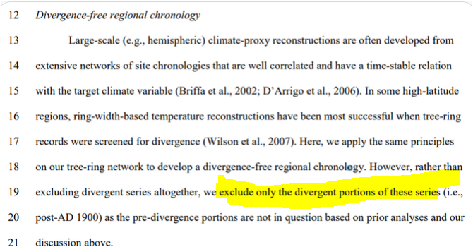
To be fair, Porter et al’s original article showed both the actual (non-descript) chronology from all trees, together with superstick resulting from “hide the decline” on individual trees: the decision to use the spurious superstick belongs to Neukom and PAGES2019.
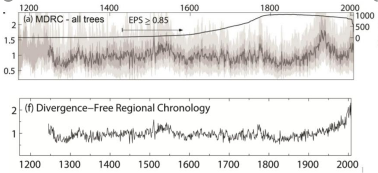
Stripbark Bristlecone Chronologies
As noted above, sharp-eyed readers may recall the identifier nv512. It is one of the classic Graybill stripbark bristlecone chronologies (Pearl Peak), which we had observed to dominate both the MBH98 PC1 and the final MBH98 reconstruction. It (and other key stripbark sites) was listed in McIntyre and McKitrick (2005 GRL) Table 1:
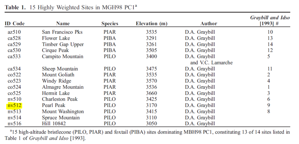
Readers will also recall that the 2006 NAS Panel recommended that “stripbark” chronologies be “avoided” in temperature reconstructions. Although the climate community has professed to implement the recommendations of the NAS Panel, they are addicted to stripbark chronologies, the properties of which are well known. Five different PAGES2019 series use stripbark bristlecones (three from original Graybill versions): nv512 (Pearl Peak); nv513 (Mount Washington); ca529 (Timber Gap Upper); SFP (an update of San Francisco Peaks, incorporating az510) and GB (a composite of Pearl Peak, Mount Washington and Sheep Mountain, using both Graybill and updated information).
In 2018, I looked at how North American tree ring networks had changed since MBH98. The one constant was the addiction of paleoclimatologists to stripbark chronologies- a phenomenon that I had commented on long before Climategate (citing Clapton et al and Paeffgen et al), much to the annoyance of dendros, but the comment remains as true now as it was then.
South American Proxies
add
Other Proxies
add
Conclusion
I discussed many of these problems in July 2019, within a couple of days of publication of the underlying article (see here). While I don’t necessarily expect IPCC reviewers to be paying rapt attention to my twitter feed, one surely presumes that IPCC climate scientists, who are employed full time on these topics, to be competent enough to notice things that I was able to observe in my first day or so of looking at PAGES2019. But their obtuseness never ceases to amaze.
