The United States has a very dense population of weather stations, data from them is collected and processed by NOAA/NCEI to compute the National Temperature Index. The index is an average temperature for the nation and used to show if the U.S. is warming. The data is stored by NOAA/NCEI in their GHCN or “Global Historical Climatology Network” database. GHCN-Daily contains the quality-controlled raw data, which is subsequently corrected and then used to populate GHCN-Monthly, a database of monthly averages, both raw and final. I downloaded version 4.0.1 of the GHCN-Monthly database on October 10, 2020. At that time, it had 27,519 stations globally and 12,514 (45%) of them were in the United States, including Alaska and Hawaii. Of the 12,514 U.S. stations, 11,969 of them are in “CONUS,” the conterminous lower 48 states. The current station coverage is shown in Figure 1.
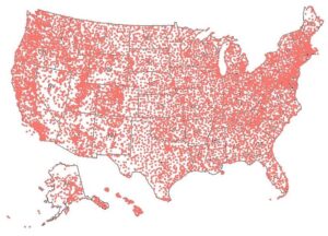
Figure 1. The GHCN weather station coverage in the United States is very good, except for northern Alaska. There are two stations in the western Pacific that are not shown.
We have several questions about the land-based temperature record, which dominates the long-term (~170-year) global surface temperature record. The land-based measurements dominate because sea-surface temperatures are very sparse until around 2004 to 2007, when the ARGO network of floats became complete enough to provide good data. Even in 2007, the sea-surface gridding error was larger than the detected ocean warming.
Ocean Warming
We have estimated that the oceans, which cover 71% of the Earth’s surface, are warming at a rate of 0.4°C per century, based on the least squares linear trend shown in Figure 2. This is a very rough estimate and based only on data from 2004 to 2019 and temperatures from the upper 2,000 meters of the oceans. The data before 2004 is so sparse we didn’t want to use it. The error in this estimate is roughly ±0.26°C, from the surface to 2,000 meters and unknown below that.
Argo measurements of ocean temperature at 2,000 meters are a fairly constant 2.4°C. So, we assumed a temperature of 0.8°C at the average ocean depth of 3,688 meters (12,100 feet) and below. For context, the freezing point of seawater at 2900 PSI (roughly 2,000 meters or 2,000 decibars) is -17°C. The value of 0.8°C is from deep Argo data as described by Gregory Johnson and colleagues (Johnson, Purkey, Zilberman, & Roemmich, 2019). There are very few measurements of deep ocean temperatures and any estimate has considerable possible error (Gasparin, Hamon, Remy, & Traon, 2020). The anomalies in Figure 2 are based on those assumptions. The calculated temperatures were converted to anomalies from the mean of the ocean temperatures from 2004 through 2019. The data used to make Figure 2 is from Jamstec. An R program to read the Jamstec data and plot it can be downloaded here, the zip file also contains a spreadsheet with more details. Our calculations suggest an overall average 2004-2019 ocean temperature of 4.6°C.
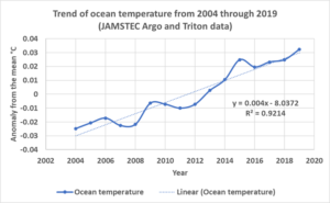
Figure 2. A plot of the global grid of ocean temperatures from JAMSTEC. It is built from ARGO floats and Triton buoy data mostly. Jamstec is the source of the grid used to compute these anomalies.
Observed ocean warming is not at all alarming and quite linear, showing no sign of acceleration. The oceans contain 99.9% of the thermal energy (“heat”) on the surface of the Earth, the atmosphere contains most of the rest. This makes it hard for Earth’s surface to warm very much, since the oceans act as a thermal regulator. Various calculations and constants regarding the heat stored in the oceans and atmosphere are in a spreadsheet I’ve prepared here. References are in the spreadsheet. The oceans control warming with their high heat capacity, which is the amount of thermal energy required to raise the average ocean temperature one degree. The thermal energy required to raise the temperature of the atmosphere 1,000 degrees C would only raise the average ocean temperature one degree.
I only mention this because, while the land-based weather stations provide us with valuable information regarding the weather, they tell us very little about climate change. Longer term changes in climate require much more information than we currently have on ocean warming. That said, let us examine the GHCN data collected in the United States.
The GHCN station data
In the U.S., and in the rest of the world, the land-based weather stations comprise most of the average temperature record in the 19th and 20th centuries. Knowing how accurate they are, and the influence of the corrections applied relative to the observed warming is important. Lots of work has been done to document problems with the land-based data. Anthony Watts and colleagues documented numerous problems with station siting and equipment in 2011 with their surface stations project. Important information on this study by John Neison-Gammon can be seen here and here. The Journal of Geophysical Research paper is here. Many of the radical changes in NOAA’s U.S. temperature index and in the underlying database in the period between 2009 and 2014 are due to the work done by Watts and his colleagues as described by NOAA’s Matthew Menne in his introductory paper on version 2 of the U. S. Historical Climatology Network (USHCN):
“Moreover, there is evidence that a large fraction of HCN sites have poor ratings with respect to the site classification criteria used by the U.S. Climate Reference Network (A. Watts 2008 personal communication; refer also to http://www.surfacestations.org).” (Menne, Williams, & Vose, 2009)
Menne, et al. acknowledged Watt’s and colleagues in their introductory paper to the revised USHCN network of stations, this suggests that the surface stations project was an important reason for the revision. USHCN was a high-quality subset of the full NOAA Cooperative Observer program (COOP) weather station network. The USHCN stations were chosen based upon their spatial coverage, record length, data completeness and historical stability, according to Matthew Menne. A set of quality control checks and corrections were developed to clean up the selected records and these are described in Matthew Menne and colleague’s publications. The main paper is cited above in the boxed quote, but he also wrote a paper to describe their Pairwise Homogenization algorithm, abbreviated “PHA” (Menne & Williams, 2009a). Stations with problems were removed from USHCN as they were found and documented by Watts, et al. As a result, the original 1218 USHCN stations dwindled to ~832 by 2020. The dismantled stations were not replaced, the values were “infilled” statistically using data from neighboring stations.
In early 2014, USHCN subset was abandoned as the source data for the National Temperature Index and replaced with a gridded instance of GHCN, but the corrections developed for USHCN were kept. They were just applied to all 12,514 U.S. GHCN stations, rather than the smaller 1,218 station (or fewer) USHCN subset.
NOAA appears to contradict this in another web page on GHCN-Daily methods. On this page they say that GHCN-Daily does not contain adjustments for historical station changes or time-of-day bias. But they note that GHCN-Monthly does. Thus, it seems that the corrections are done after extracting the daily data and while building the monthly dataset. NOAA does not tamper with the GHCN-Daily raw data, but when they extract it to build GHCN-Monthly, they apply some dramatic corrections, as we will see. Some NOAA web pages hint that the time-of-day bias corrections have been dropped for later releases of GHCN-Monthly, but most explicitly say they are still being used, so we assume they are still in use. One of the most worrying findings was how often, and how radically, NOAA appears to be changing their “correction” procedures.
The evolving U.S. Temperature Index
The current U.S. “National Temperature Index,” draws data from five-kilometer grids of the GHCN-Monthly dataset. The monthly gridded dataset is called nClimGrid, and is a set of map grids, not actual station data. The grids are constructed using “climatologically aided interpolation” (Willmott & Robeson, 1995). The grids are used to populate a monthly average temperature dataset, called nClimDiv. nClimDiv is used to create the index.
Currently, the NOAA base period for nClimDiv, USHCN, and USCRN anomalies is 1981-2010. We constructed our station anomalies, graphed below, using the same base period. We accepted all stations that had at least 12 monthly values during the base period and rejected stations with fewer. This reduced the number of CONUS stations from 11,969 to 9,307. No stations were interpolated or “infilled” in this study.
Some sources have suggested data outside the GHCN-Daily dataset might be used to help build the nClimDiv monthly grids and temperature index, especially some nearby Canadian and Mexican monthly averages. But NOAA/NCEI barely mention this on their website. nClimDiv contains climate data, including precipitation, and a drought index, as well as average monthly temperature. As mentioned above, the same corrections are made to the GHCN station data as were used in the older USHCN dataset. From the NOAA website:
“The first (and most straightforward) improvement to the nClimDiv dataset involves updating the underlying network of stations, which now includes additional station records and contemporary bias adjustments (i.e., those used in the U.S. Historical Climatology Network version 2)” source of quote: here.
Besides the new fully corrected GHCN-Monthly dataset and the smaller USHCN set of corrected station data, there used to be a third dataset, the original NOAA climate divisional dataset. Like GHCN-Daily and nClimDiv, this older database used all the COOP network of stations. However, the COOP data used in the older Climate Division dataset (called “TCDD” in Fenimore, et al.) was uncorrected. This is explained in a white paper by Chris Fenimore and colleagues (Fenimore, Arndt, Gleason, & Heim, 2011). Further, the data in the older dataset was simply averaged by climate division and state, it was not gridded, like nClimDiv and USHCN. There are some new stations in nClimDiv, but most are the same as in TCDD. The major difference in the two datasets are the corrections and the gridding. Data from this earlier database is plotted as a blue line in Figures 6 and 7 below.
The simple averages used to summarize TCDD, ignored changes in elevation, station moves and other factors that introduced spurious internal trends (discontinuities) in many areas. The newer nClimDiv monthly database team claims to explicitly account for station density and elevation with their “climatologically aided interpolation” gridding method (Fenimore, Arndt, Gleason, & Heim, 2011). The methodology produces the fully corrected and gridded nClimGrid five-kilometer grid dataset.
nClimDiv is more useful since the gradients within the United States in temperature, precipitation and drought are more accurate and contain fewer discontinuities. But, as we explained in previous posts, when nClimDiv is reduced to a yearly conterminous U.S. (CONUS) temperature record, it is very similar to the record created by the older, official temperature record called USHCN, when both are gridded the same way. This may be because, while nClimDiv has many more weather stations, the same corrections are applied to them as were applied to the USHCN stations. While USHCN has fewer stations, they are of higher quality and have longer records. The additional nClimDiv stations, when processed the same way as the USHCN stations, do not change things, at least on a national and yearly level. As noted in a previous post, stirring the manure faster, with more powerful computers and billions of dollars, doesn’t really matter for widespread averages.
There are good reasons for all the corrections that NOAA applies to the data. The gridding process undoubtably improves the usefulness of the data internally. Artificial mapping discontinuities are smoothed over and trends will be clearer. But the corrections and the gridding process are statistical in nature, they do nothing to improve the accuracy of the National Temperature Index. If a specific problem with a specific thermometer is encountered and fixed, accuracy is improved. If the cause is not known and the readings are “adjusted” or “infilled” using neighboring thermometers or a statistical algorithm, the resulting maps will look better, but they are no more accurate.
The move from USHCN to nClimDiv for the National Temperature Index
How much of the National Temperature Index trend is due to actual warming and how much is due to the corrections and the gridding method? How much error is in the final temperature anomaly estimates? Decades of criticism and NOAA’s revisions of the calculation have not answered this question or changed the result. Figure 3 shows the National Temperature Index, extracted from the NOAA web site on November 18, 2020. Both the USHCN and the nClimDiv computations are plotted. Remember the slope of the least squares line, 1.5°C per century, it will be important later in the post.
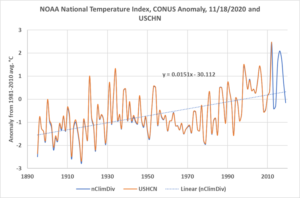
Figure 3. The nClimDiv and USHCN climate anomalies from the 1981-2010 average. The data was downloaded from their web page. Both datasets plotted are from grids, not station data. CONUS is an abbreviation for the lower 48 states, the conterminous states.
It has long been known that the National Temperature Index does not follow the underlying published data. Anthony Watts has reported this, as have Jeff Masters, Christopher Burt, and Ken Towe. The problems exist in both the GHCN data and in the USHCN data as reported by Joseph D’Aleo. Brendan Godwin suspects that the “homogenization” algorithms (see the discussion of PHA above) in use today are to blame. When the “corrected” data has a very different trend than the raw data, one should be skeptical.
Anthony Watts does not believe that the underlying problems with the full COOP network of weather stations have been fixed as he explained here last year. He believes that NOAA is “sweeping the problem under the rug.” The data plotted in Figure 3 is fully corrected and gridded, it is not a plot of station data. In Figure 4 we plot the fully corrected station data in blue and the raw station data in orange from the CONUS portion of GHCM-Monthly. This is the same data used to build the nClimDiv curve plotted in Figure 3, but Figure 4 is actual station data.
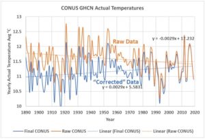
Figure 4. The orange line is the uncorrected monthly mean temperature, which is “qcu” in NOAA terminology. The blue line is corrected, or NOAA’s “qcf.”
Figure 4 shows the actual measurements from the stations, these are not anomalies and the data are not gridded. The raw data shows CONUS is cooling by 0.3°C per century, while the corrected data shows CONUS is warming by 0.3°C degrees per century. These lines, like all the fitted lines in this post, are Excel least squares trend lines. The lines are merely to identify the most likely linear trend in the data, thus the R2 is irrelevant, we are not trying to demonstrate linearity.
The difference between the two curves in Figure 4 is shown in Figure 5. The slope of the difference is a warming trend of 0.57°C per century. This is the portion of the warming in Figure 3 directly due to the corrections to the measurements.
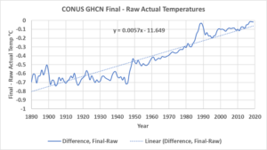
Figure 5. This plots the difference (Final-Raw) between the two actual station temperature curves in Figure 4. As you can visually see, the difference between the final and raw curve trends, since 1890, is about 0.8°C, roughly the claimed warming of the world over that period.
To many readers Figure 4 will look familiar. Steven Goddard’s Real Science blog published a 1999 NASA GISS version of the CONUS raw data anomalies in 2012. The dataset he used has since been deleted from the NASA website, but a copy can be downloaded here and is plotted in Figure 6, along with the current (October 2020) GHCN-M raw data. We are switching from the actual temperature measurements in Figure 4 to weather station anomalies from the 1981-2010 mean in Figure 6.
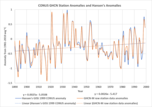
Figure 6. The 1999 NASA GISS raw CONUS temperature anomalies compared to the 2020 GHCN-M raw CONUS anomalies. The 1999 NASA anomalies are shifted down .32°C so the means from 1890 to 1999 match. This is to compensate for the base line differences. Notice the least squares trends match very closely. Hansen’s data shows a warming trend of 0.25°C per century and the modern data shows warming of 0.26°C per century. The equations for the lines are in the legend. See the text for the data sources.
Both the current data and the 1999 data show about 0.25°C per century of warming. Figure 7 shows the same GISS 1999 raw data anomalies compared to the 2020 GHCN-M final temperature anomalies. All three plots suggest it was as warm or warmer in 1931 and 1933 in the conterminous U.S. states as today. The various corrections applied to the raw data and turning the actual temperatures into anomalies have the effect of lessening the difference between the 1930s and today, but they don’t eliminate it, at least not in the station data itself. When the data is gridded, as it was to make Figure 3, the trend is fully reversed, and modern temperatures are suddenly much warmer than in the 1930s. The 1999 data again shows warming of 0.25°C per century, but the corrected data shows warming of 0.6°C per century. This is very similar to the warming seen in Figure 5, that is the warming due to the corrections alone.
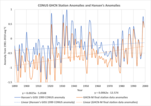
Figure 7. The 2020 GHCN-M final and fully corrected station data is compared to the 1999 NASA/GISS CONUS anomalies. The equations for the lines are in the legend.
The blue 1999 GISS anomaly lines in Figures 6 and 7 are identical, the orange line in Figure 6 is raw data and the orange line in Figure 7 is final, corrected data. The largest corrections are in the earlier times and the smaller corrections are in the recent temperatures.
The WUWT resident wit, and all-around good guy, Dave Middleton, commented on this in 2016:
“I’m not saying that I know the adjustments are wrong; however anytime that an anomaly is entirely due to data adjustments, it raises a red flag with me.” Middleton, 2016
I agree, logic and common sense suggest Dave is correct to be skeptical.
James Hansen wrote about this issue in 1999:
“What’s happening to our climate? Was the heat wave and drought in the Eastern United States in 1999 a sign of global warming?
Empirical evidence does not lend much support to the notion that climate is headed precipitately toward more extreme heat and drought. The drought of 1999 covered a smaller area than the 1988 drought, when the Mississippi almost dried up. And 1988 was a temporary inconvenience as compared with repeated droughts during the 1930s “Dust Bowl” that caused an exodus from the prairies, as chronicled in Steinbeck’s Grapes of Wrath.” Source.
For once, I agree with James Hansen.
Zeke, at rankexploits.com, the “Blackboard,” tried to defend the corrections in 2014. Zeke tells us that USHCN and GHCN are first corrected for time-of-measurement bias (“TOB”), then the stations are compared to their neighbors, and a pairwise homogenization algorithm (PHA) is used to smooth out suspected anomalies. These are presumably due to station moves, changes in the station environment, or equipment changes. Finally, missing station data are filled in using neighboring stations as a guide. The last step to make nClimDiv is to grid the data.
Zeke notes that the TOB and PHA corrections are not really necessary since the gridding process alone will probably do the same thing. Not understanding all the details of all these statistical data smoothing operations, I won’t offer an opinion on Zeke’s comment. But, from a general mapping perspective he has a point. You want to map a dataset that is as close to the measurements as possible. When you apply three smoothing algorithms to the measurements before you contour them and grid them, what do you have? What does it mean?
We will not get into the details of the NOAA corrections here, they are statistical, and not corrections to specific instruments to correct for known problems. Thus, they are different flavors of smoothing operations applied sequentially to the measurements. The TOB correction is described by Thomas Karl and colleagues (Karl, Williams, Young, & Wendland, 1986). NOAA averages minimum and maximum daily temperatures to derive the average daily temperature, so it matters whether the two temperature readings are recorded from the min-max thermometer at midnight or some other time of the day. When calculations are done using monthly averages this difference is very small. Some NOAA web pages suggest that the TOB correction has been dropped for more recent versions of GHCN-Monthly, others say it is still used. Either way it probably doesn’t make much difference in GHCN-Monthly or nClimDiv.
The second correction is the pairwise homogenization algorithm or PHA. This algorithm compares each station to its neighbors to determine if there are unusual anomalies and then attempts to fix them. This process is purely a statistical smoothing algorithm. It is described by Matthew Menne and Claude Williams (Menne & Williams, 2009a). This process is definitely being used in the most recent version of GHCN-Monthly.
The final step in the smoothing process is the infilling of missing values using neighboring station data. This is done prior to gridding so more grid cells are populated. Infilling is probably still being done in the most recent version.
Zeke makes the point that graphing actual temperatures, as we did in Figure 4, can be misleading. Over the course of the past 130 years, stations have moved, been added, removed, and the spatial distribution of stations has changed. The mean elevation of the stations has changed over time. These changes affect station anomalies less than the absolute temperatures. True enough, and this accounts for some of the difference between Figure 4 and Figures 6 and 7. Beyond a certain point the number of stations doesn’t matter, as can be seen in Figure 3. We start our plots in 1890 or 1895 because this is when we assume that sufficient stations in CONUS exist to get a meaningful average. The USHCN dataset has 143 stations in 1890 and 608 in 1895 and these are the stations with the longest records and the best placement.
Discussion and Conclusions
Zeke’s next point is that Goddard did not grid his data. Thus, he did not deal with the uneven distribution of stations and the changing distribution of stations over time. These are real problems and they do affect internal trends within CONUS but gridding and the other corrections only smooth the data. None of these operations improve accuracy. In fact, they are more likely to reduce it. If we were using maps of CONUS data to identify trends within the country, I would agree with Zeke, smooth the data. But here we are concerned only about the National Temperature Index, which is external to CONUS. The index is an average temperature for the whole country, no statistical smoothing or gridding operation will improve it. Using anomalies, versus actual temperatures, is important, otherwise no.
An average of the station data anomalies is more appropriate than using a grid to produce a national average temperature trend. The average is as close to the real observations as you can get. The corrections and the gridding remove us from the measurements with several confounding steps.
If the corrections fixed known problems in the instruments, that would help accuracy. But they are statistical. They make the station measurements smoother when mapped and they smooth over discontinuities. In my opinion, NOAA has overdone it. TOB, PHA, infilling and gridding are overkill. This is easily seen in Figure 7 and by comparing Figure 3 to Figure 6 or Figure 5. Does the final trend in Figure 3 more closely resemble the measurements (Figure 6) or the net corrections in Figure 5? The century slope of the data is 0.25°, the corrections add 0.35° to this and the “climatological gridding algorithm” adds 0.9°! It is worth saying again, the type of statistical operations we are discussing do nothing to improve the accuracy of the National Temperature Index, and they probably reduce it.
CONUS is a good area to use to check the viability of the “corrections” to the station data and the efficacy of the temperature gridding process. The current station coverage is very dense, as seen in Figure 1, and one would expect the gridded data to match the station data quite well. Figure 3 looks like the orange “final” curve in Figure 7, but it is steeper somehow, and that tells you all you need to know.
Dave Middleton and I have been (in my case “was”) in the oil and gas business for a long time. Between us we have seen more mapped BS than you could find in the Kansas City stockyards. My internal BS meter red-lines when I hear a laundry list of smoothing algorithms, correction algorithms, bias adjustments, etc. I want to scream “keep your &#$@ing maps and calculations as close to the real data as possible!”
In the first part of this post, I pointed out that to study climate change, we need to know more about ocean warming and the distribution and transport of thermal energy in the oceans. Land-based weather stations help predict the weather, but not climate. We argue a lot about relatively small differences in the land-surface temperatures. These arguments are interesting, but they don’t matter very much from the standpoint of climate change. The oceans control that, the atmosphere above land has little to do with it. Taking the raw data from GHCN-Daily and running it through four different smoothing algorithms (TOB, PHA, infilling and gridding) is, with all due respect, ridiculous. My recommendation? Don’t believe any of it, not that it matters much as far as climate is concerned.
A better indicator of climate change or global warming is the trend of ocean warming, shown in Figure 2. Notice the trend over the past 16 years is only 0.4°C per century. Compare this to the CONUS land-based measurements over the past 130 years, they predict 0.25°C, as shown in Figure 6, but NOAA’s fully “corrected” value is 1.5°C, as shown in Figure 3. Truly, which do you believe?
I used R to do the calculations plotted in the figures, but Excel to make the graphs. If you want to check the details of my calculations, you can download my GHCN R source code here.
None of this is in my new book Politics and Climate Change: A History but buy it anyway.
You can download the bibliography here.

Andy May, now retired, was a petrophysicist for 42 years. He has worked on oil, gas and CO2 fields in the USA, Argentina, Brazil, Indonesia, Thailand, China, UK North Sea, Canada, Mexico, Venezuela and Russia. He specializes in fractured reservoirs, wireline and core image interpretation and capillary pressure analysis, besides conventional log analysis. He is proficient in Terrastation, Geolog and Powerlog software. His full resume can be found on linkedin or here: AndyMay
